



Brass, chrome and polished nickel can occupy exactly the same places in an interior and still create remarkably different rooms. A faucet, lamp, cabinet pull or table edge may keep the same shape, yet changing the metal finish can shift the surrounding stone warmer, make timber appear richer, sharpen a white bathroom or change whether an entire room reads as glamorous, crisp or quietly refined.
The difference is easier to understand when the finishes are compared by temperature, reflectivity and visual weight rather than by color alone.
Brass usually introduces the warmest presence. Depending on its finish, it can move from muted antique gold to brighter polished yellow tones. Chrome is generally the coolest and most mirror-like of the three, producing crisp reflections that work naturally with white, black, glass and cooler stone. Polished nickel occupies a useful middle position. It is silver-toned like chrome but often appears softer and slightly warmer, particularly under warm residential lighting.
That middle ground is precisely why polished nickel and chrome are so easily confused in product photographs. Both may look simply “silver” on a screen. Place them side by side in the same room, however, and differences in reflection, undertone and visual softness become much easier to notice.
The decision also extends beyond appearance. The same finish can perform differently depending on whether it appears on a large pendant, a tiny cabinet pull, a frequently touched faucet or a furniture frame. Lighting conditions matter. Nearby timber and stone matter. Whether other metals are already present matters.
For a Neo Deco interior, brass may seem like the obvious choice because of its relationship with walnut, cognac leather and richly colored stone. Yet polished nickel can create a sharper, more metropolitan version of the same style, while chrome can move the room toward cleaner contemporary territory.
The useful question is therefore not “Which metal is best?” It is:
Which finish produces the right temperature, level of reflection and contrast for the materials already in the room?
Brass vs Chrome vs Polished Nickel at a Glance
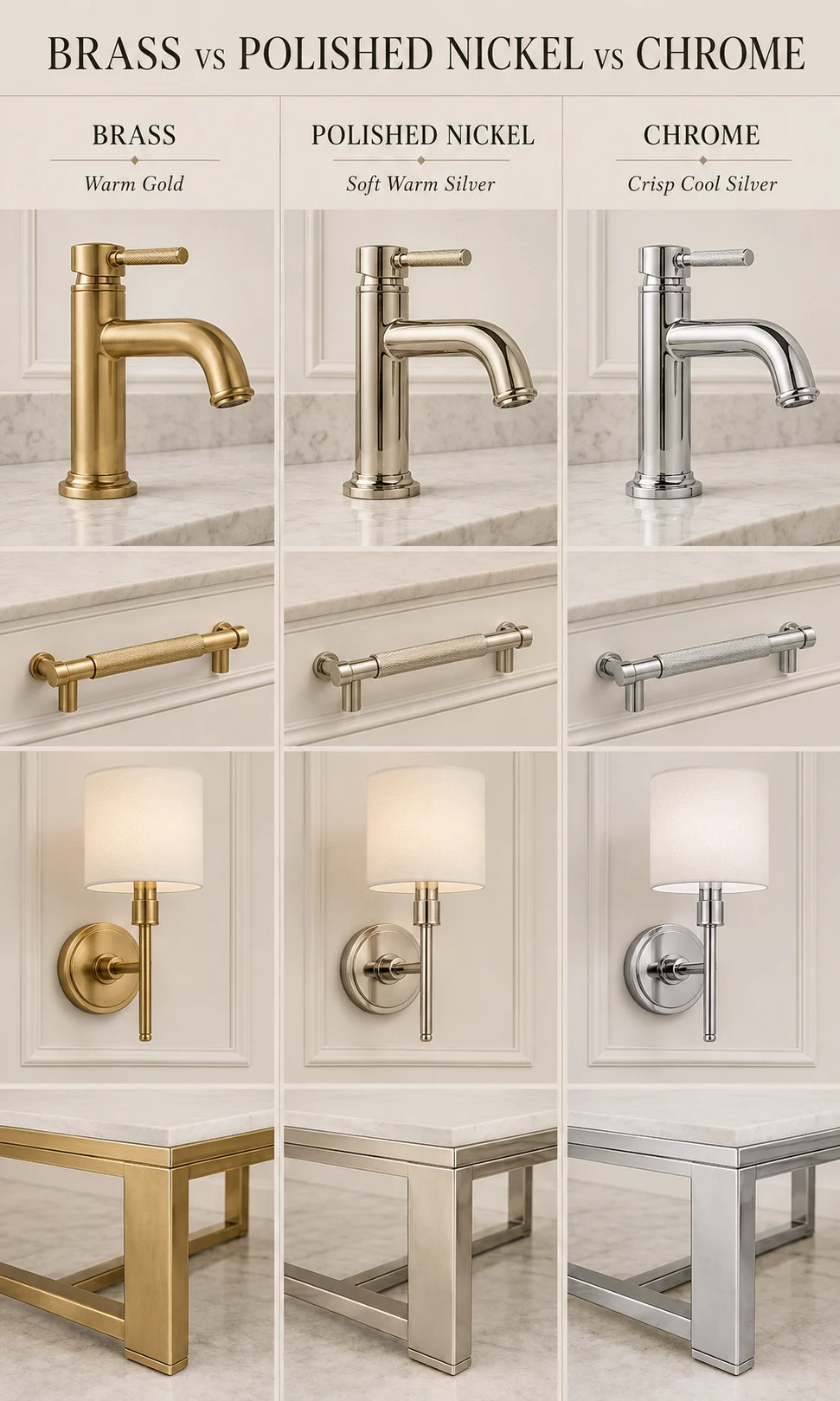
The easiest way to understand the three finishes is to imagine the same object rendered in each one.
Brass generally adds color. Even a relatively restrained satin brass faucet becomes part of the palette because the metal reads as gold, amber or muted yellow against surrounding materials.
Chrome behaves more like a mirror. It strongly reflects whatever is nearby, so a chrome fitting can appear almost black beside a dark surface, bright white beside a window or slightly warmer under artificial lighting. Its identity comes as much from reflection as from its inherent silver tone.
Polished nickel sits between these two effects. It remains reflective and distinctly metallic, yet the reflection often appears a little softer and warmer than chrome. This gives it unusual flexibility in rooms that combine warm and cool materials.
| Finish | Visual Temperature | Reflection Character | Usually Works Well With |
|---|---|---|---|
| Brass | Warmest of the three, ranging from muted gold to brighter yellow-gold | Soft to highly reflective depending on brushed, satin or polished finish | Walnut, cognac leather, burgundy, cream stone, deep green and warm plaster |
| Polished nickel | Neutral to subtly warm silver | Bright but generally softer and warmer-looking than chrome | Cream, taupe, walnut, white marble, warm gray and transitional palettes |
| Chrome | Coolest and crispest | Highly mirror-like with sharper reflections | White, black, glass, cooler gray, pale stone and contemporary cabinetry |
This comparison is most useful as a starting point rather than a rigid style rule. Brushed brass can look surprisingly quiet in a minimalist interior, while chrome can work inside a warm room if surrounding materials soften its reflection. Polished nickel can also appear distinctly warm or cool depending on the light and neighboring finishes.
The Biggest Difference Is Temperature, Not Luxury
Brass, chrome and polished nickel can all look luxurious. Their difference lies in how they change the temperature of the materials around them.
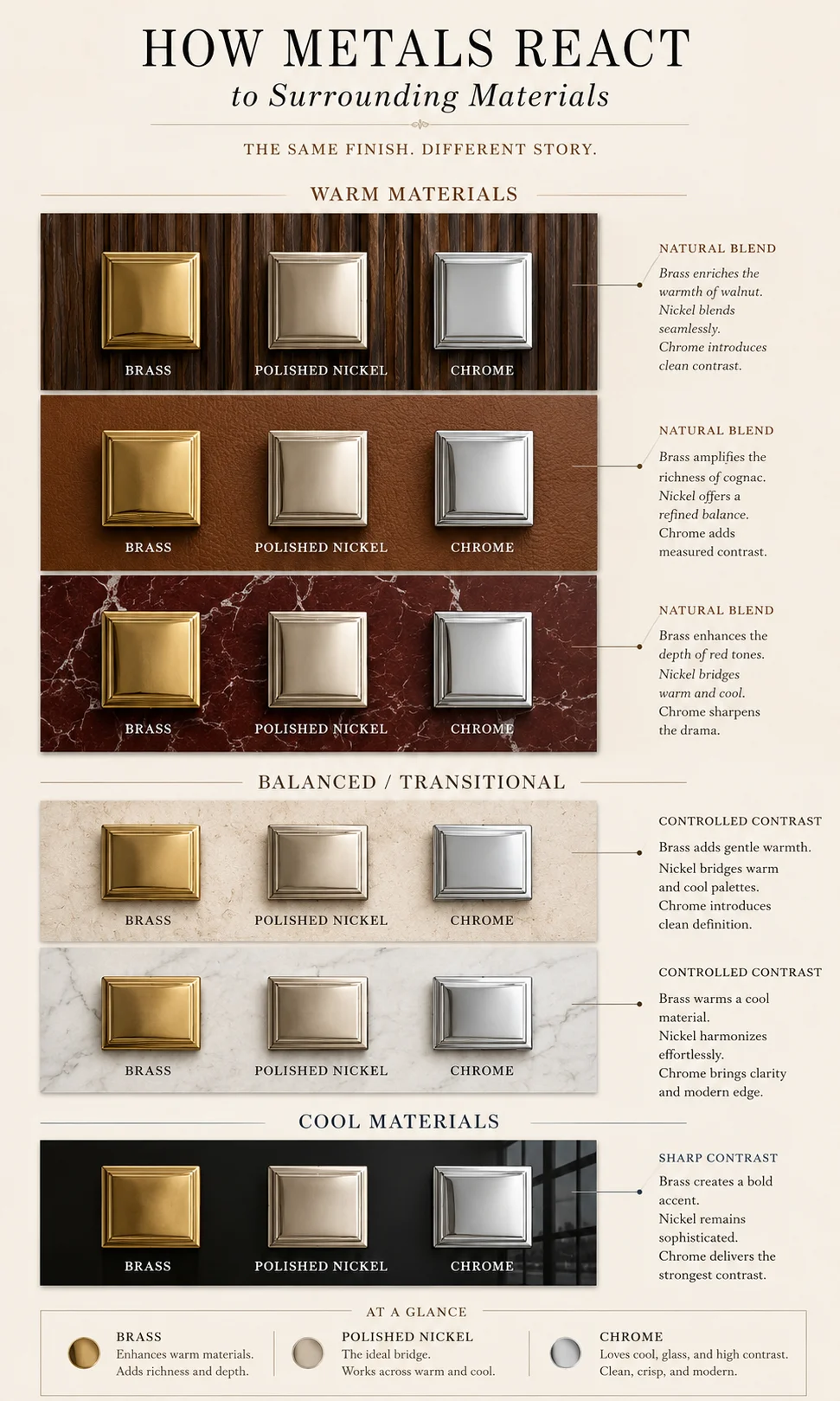
A room does not perceive metal in isolation. Brass beside walnut reinforces the timber’s amber and brown tones. Chrome beside the same walnut creates more contrast, making the silver appear cooler and the timber comparatively warmer. Polished nickel produces a less dramatic separation, allowing both materials to retain some visual warmth.
This interaction becomes more noticeable as the metal area increases.
A tiny chrome cabinet pull may contribute very little to the overall room temperature. A large chrome chandelier, shelving system or table frame can change the entire visual atmosphere because more reflected light and surrounding color become visible across the metal.
The size of the application should therefore influence how seriously the undertone is treated.
Warm Materials Usually Make Brass Feel Natural
Walnut, cognac leather, burgundy, terracotta, warm white and cream stone already contain yellow, orange or red undertones. Brass generally sits comfortably beside them because it extends the same side of the temperature spectrum.
This explains why brass appears so frequently in Neo Deco living rooms. Curved cognac furniture, dark timber and richly colored marble naturally support a warm metallic highlight.
The room does not need much of it.
A pair of sconces, selected lamp detail or a restrained table edge may be enough to establish the relationship. If brass appears on every furniture leg, frame, shelf, handle and decorative object, its warmth stops acting as an accent and becomes the background condition.
Cooler Rooms Make Chrome Feel Especially Crisp
Chrome becomes more natural when the surrounding palette includes bright white, black, cool gray, glass or pale stone.
Its mirror-like character can reinforce the precision of contemporary cabinetry and make a bathroom or kitchen feel cleaner visually. In a living room, chrome can sharpen a black-and-ivory palette that might otherwise feel soft.
The finish also reflects its surroundings strongly enough that it can become less obviously silver in real installations. A chrome leg beside black furniture may contain broad dark reflections. The same leg beside pale stone can appear substantially brighter.
Chrome should therefore be judged in context rather than from a supplier’s isolated product image.
Polished Nickel Bridges Warm and Cool Materials
Polished nickel becomes particularly useful when the room contains both temperature families.
Imagine cream stone, walnut cabinetry and white walls. Brass may push the palette noticeably warmer, while chrome may create a sharper contrast than intended. Polished nickel can sit between them, providing a silver finish without making the entire room feel cooler.
This does not make polished nickel universally safer.
A room that depends on crisp black-and-white contrast may actually benefit from chrome’s cleaner brightness. A rich burgundy-and-walnut interior may gain more character from brass. The value of polished nickel is its ability to remain silver while interacting comfortably with warmer surfaces.
Brass Changes Dramatically Depending on Its Finish
“Brass” is not one visual result.
Polished brass, satin brass, brushed brass, unlacquered brass and antique-looking brass can behave so differently that they should be treated almost like separate design decisions.
Polished Brass Creates the Strongest Glamour
Polished brass has a brighter, more reflective surface and can become a powerful decorative element.
In a Neo Deco room, it can work beautifully on a sculptural lamp or controlled furniture detail because its reflection reinforces the polished-material language of the style.
Large quantities require restraint. A polished brass chandelier combined with glossy brass furniture, gold-framed mirrors and metallic cabinetry can create enough reflective activity that the room begins to feel more theatrical than refined.
Polished brass works best when surrounding materials provide enough matte contrast.
Brushed and Satin Brass Are Easier to Use Broadly
A softer brushed or satin surface reduces the mirror effect while preserving the warmth.
This makes the finish easier to repeat across cabinet hardware, sconces, faucets or furniture details without every metal element demanding attention.
Against heavily veined stone, brushed brass is often especially useful because the stone already provides movement. The quieter metal can support it without creating another high-reflection surface.
The same principle appears in red marble bathroom design, where the strongest stone usually benefits from a more controlled supporting finish rather than another equally expressive material.
Living Brass Can Develop Character Over Time
Some brass products are intentionally left without a protective lacquer so the surface can darken and develop patina with handling and exposure.
That can be highly desirable in a room where material aging is part of the design language. It can also frustrate somebody expecting the metal to remain uniformly bright.
The decision should be made consciously.
A patinated brass handle can feel beautifully natural beside walnut and leather. A client expecting a consistently polished golden appearance may interpret the same change as deterioration.
Always confirm the manufacturer’s finish specification rather than assuming every brass-colored product will age in the same way.
Chrome Is More Than the Cheap or Modern Option
Chrome is sometimes dismissed as the default bathroom metal because it is widely available. That overlooks the qualities that make it useful.
Its high reflectivity can make relatively small fittings visually disappear into the surrounding room. Instead of contributing a strong color like brass, chrome often borrows color from adjacent materials.
This can be especially effective where the architecture itself should remain dominant.
A chrome faucet against dramatic stone may read as a clean reflective line rather than another color. A chrome furniture frame can bring precision to a soft upholstered room without introducing a new warm tone.
Chrome Creates Strong Contrast Against Dark Materials
Black lacquer, smoked glass, espresso timber and dark stone all make bright chrome significantly more visible.
This contrast can look exceptionally sharp in contemporary interiors.
The same relationship can become too graphic in rooms aiming for softness. A bright chrome floor lamp against warm plaster and muted textiles may stand out more than expected because its reflections are so precise.
If the fixture shape is already sculptural, the metal does not necessarily need to become equally assertive.
Chrome Works Particularly Well With Glass
Because glass and chrome both interact strongly with light, they can produce a clean, almost weightless relationship.
Chrome-framed glass shelving, a small chrome-and-glass occasional table or a contemporary lamp can provide visual lightness inside a room containing heavier timber and upholstery.
The combination is especially effective when another material supplies warmth.
Chrome, glass, walnut and cream upholstery can feel more balanced than chrome and glass alone because the timber prevents the room from becoming too cold.
Polished Nickel Is Not Simply Expensive Chrome
Polished nickel and chrome are both silver finishes, but treating them as interchangeable can lead to disappointing results.
Polished nickel generally has a softer, slightly warmer visual character. Under warm residential lighting, the difference can become particularly noticeable. Chrome tends to return a cleaner, sharper reflection, while polished nickel may appear deeper or more champagne-silver.
That subtlety is precisely what makes polished nickel useful in transitional and contemporary luxury interiors.
Nickel Can Make Silver Feel Warmer
A room with walnut cabinetry may need a silver fitting for contrast but still want to preserve warmth.
Polished nickel can perform that role elegantly.
It reflects the timber and surrounding warm light without appearing as cool as chrome can. Beside cream stone, the metal often feels more integrated than strongly contrasting.
This is one reason polished nickel works particularly well where classic and contemporary materials overlap.
The Difference Becomes Easier to See Under Controlled Light
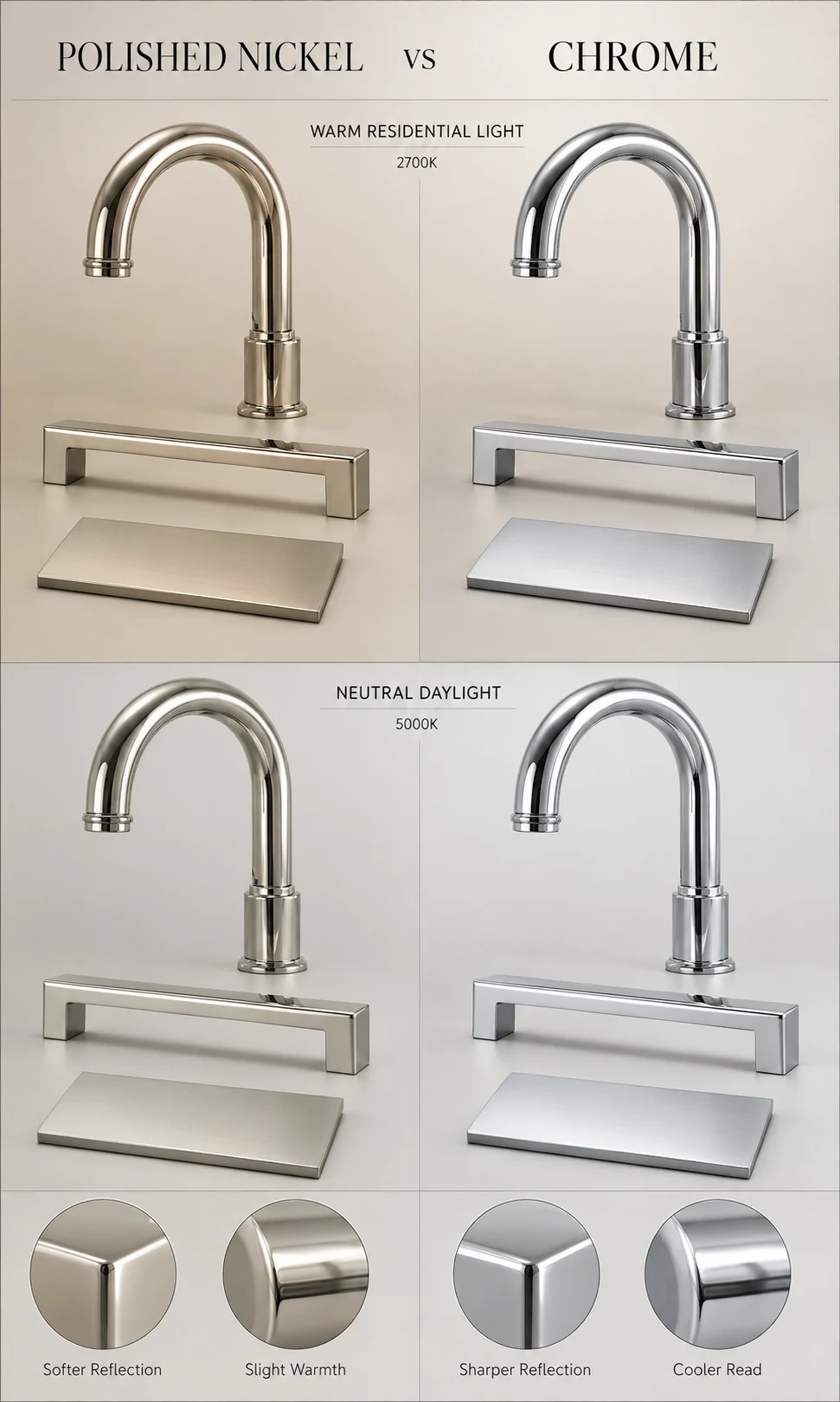
Looking at polished nickel and chrome separately makes comparison difficult.
Place two identical objects beside each other under the same lighting and the distinction becomes clearer. Chrome usually reads brighter and slightly cooler. Polished nickel tends to look somewhat softer and warmer.
The difference is subtle enough that the upcoming internal comparison image should use identical hardware, identical backgrounds and identical illumination. Otherwise the lighting difference may be mistaken for a material difference.
Reflectivity Changes How Large a Metal Finish Feels
Highly reflective materials can occupy little physical area and still attract considerable attention.
A thin polished chrome furniture frame may catch several bright highlights and appear more visually active than a much larger matte timber surface. Polished brass can do the same through color as well as reflection.
Brushed finishes usually create less visual interruption because the surface scatters light more diffusely.
This is why finish choice should consider visual area, not simply physical area.
A five-centimeter polished-metal strip running around an entire room may have more visual impact than one substantial metal lamp.
Large Metal Surfaces Need More Restraint
If metal appears across cabinetry, shelving or a large table base, a softer finish is often easier to integrate.
Brushed brass, satin nickel or another less reflective treatment can preserve the material identity without creating a wall of reflections.
Smaller decorative objects can tolerate stronger polish because their area is limited.
The room can therefore use different levels of reflection within the same metal family while remaining visually coherent.
The Same Room Can Change Completely With Only the Metal Finish
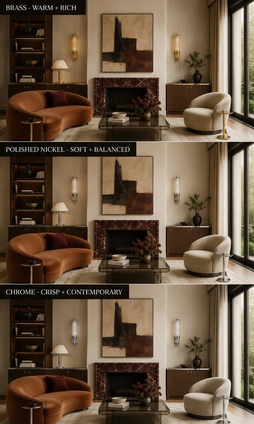
Imagine one room with cream plaster walls, walnut cabinetry, pale stone flooring and a curved neutral sofa.
With brass, the room becomes warmer. Walnut appears richer, cream surfaces become more golden and the overall atmosphere moves toward softness and glamour.
Replace the same hardware and lighting with polished nickel, and the room becomes more neutral. The walnut still feels warm, but the metal provides enough silver contrast to make the architecture feel sharper.
Replace it again with chrome, and the room becomes crisper. The pale surfaces appear cleaner, black details become more graphic and the overall result moves toward contemporary precision.
Nothing else needs to change for the atmosphere to shift.
That is why choosing a metal finish late in a project can have a larger effect than its relatively small physical area suggests.
Which Metal Works Best in a Bathroom?
Bathrooms make metal selection unusually visible because faucets, shower controls, towel rails, mirror frames and lighting often sit close together. The room also contains hard reflective surfaces, which means the metal interacts constantly with stone, glass, mirrors and artificial light.
Brass usually creates the warmest bathroom. It works particularly well with cream stone, red or burgundy marble, walnut cabinetry and warm white walls. A brushed brass faucet against expressive stone can feel rich without becoming overly formal, especially when the remaining hardware stays within the same family.
Chrome creates a cleaner, brighter bathroom. It works naturally with white porcelain, clear glass, cooler gray stone and black details. Because chrome is highly reflective, it often feels visually lighter than an equally sized brass fitting.
Polished nickel occupies the middle ground. It is especially useful when the room contains warm stone or timber but the designer still wants a silver-toned finish.
Brass Makes the Bathroom Feel Warmer
A warm metal can reduce the clinical feeling sometimes created by white porcelain and pale stone.
This is why brass works so effectively in bathrooms using cream limestone, travertine-like surfaces or richly veined marble. The metal reinforces warmth already present within the material palette instead of introducing another temperature family.
The finish matters. Highly polished brass can make a bathroom feel more glamorous, while brushed or satin brass usually creates a quieter residential result.
In a dramatic red marble bathroom design, brushed brass is often enough. The stone already supplies considerable visual movement, so the metal can remain comparatively restrained.
Chrome Creates the Crispest Wet-Room Character
Chrome can make a bathroom feel particularly clean because its sharp reflection works naturally beside mirrors, glass and porcelain.
The finish is also widely available across plumbing collections, which can make it easier to keep faucets, shower hardware and accessories visually consistent.
That availability should not be the only reason to choose it. Chrome works best when its cool clarity is actually compatible with the surrounding materials.
A room built around cream limestone, walnut and warm plaster may feel more coherent with polished nickel or brass. A black-and-white bathroom with clear glass and cooler stone can benefit from chrome’s sharper character.
Polished Nickel Can Soften a Silver Bathroom
Polished nickel is particularly useful when chrome feels too cold but brass feels too warm.
Against white marble containing warmer gray, beige or subtle gold veining, polished nickel can provide enough silver contrast without appearing stark. It also relates comfortably to cream cabinetry, taupe walls and medium walnut.
That makes it a strong option for bathrooms where the desired result sits between traditional warmth and contemporary sharpness.
Which Finish Works Best in a Kitchen?
Kitchen metals are distributed differently from bathroom metals.
A faucet may be large and highly visible, but cabinet hardware repeats across many doors and drawers. Pendant lights can introduce substantial metallic surface area overhead, while appliance finishes may add another silver family whether the designer wants them to or not.
The first kitchen question should therefore be:
What metal is already unavoidable?
If stainless steel appliances dominate the room, adding polished nickel or chrome can reinforce that cooler metallic language. Brass can instead create intentional contrast, especially beside walnut, dark green or cream cabinetry.
Brass Works Particularly Well With Warm Cabinetry
Walnut, oak, dark green, burgundy and warm off-white cabinetry all provide natural partners for brass.
Small handles can establish enough warmth without requiring brass on every other object. If the faucet, pendants and hardware are all brass, consider keeping other decorative metal details quieter.
A kitchen can become visually saturated surprisingly quickly because hardware repeats dozens of times.
The more repeated the fitting, the less visually assertive each individual piece needs to be.
Chrome Can Keep a Contemporary Kitchen Visually Light
Chrome faucets and lighting details work well with white cabinetry, glass, pale engineered surfaces and high-contrast black accents.
Because chrome reflects the room strongly, it can almost disappear against bright surroundings. This makes it useful where the architecture and cabinetry should carry the main visual identity.
Large expanses of dark cabinetry create the opposite effect. Chrome becomes much more visible because the silver highlights stand sharply against the darker background.
Polished Nickel Can Bridge Stainless Steel and Warm Materials
A kitchen may contain stainless appliances, warm timber cabinetry and creamy stone all at once.
Polished nickel can mediate between those groups more gently than chrome. It remains silver enough to relate to the appliances while appearing softer beside timber and warm lighting.
This is one reason it works well in transitional kitchens, where classic cabinet proportions coexist with contemporary appliances and cleaner architectural details.
Which Metal Works Best in a Living Room?
Living rooms use metal differently because plumbing fixtures are absent and the finish appears mostly through lighting, furniture, shelving and decorative objects.
That gives designers more freedom.
Brass can become a strong decorative accent because it appears in larger sculptural forms. Chrome can create a sharper furniture language. Polished nickel works well when silver is desired without making the room feel overly cool.
Brass Fits Naturally Into Neo Deco
Brass has a particularly strong relationship with Neo Deco living room design because it connects easily with walnut, cognac upholstery, smoked glass and expressive stone.
The key is limiting where it appears.
A brass chandelier and two small furniture details may establish enough warmth. Repeating the same bright metal on every table, lamp, shelf and frame reduces hierarchy.
Neo Deco benefits from brass when the metal behaves like punctuation rather than wallpaper.
Chrome Can Make Sculptural Furniture Feel More Contemporary
A chrome-framed lounge chair, table base or floor lamp can introduce a crisp modern line into a room dominated by upholstery and timber.
This is useful when the interior needs relief from warm materials.
A curved cognac sofa paired with dark walnut and a polished chrome side table can feel significantly more contemporary than the same room using brass.
Chrome therefore does not necessarily contradict Neo Deco. It simply changes which part of the style becomes dominant.
Polished Nickel Creates a Quieter Luxury
Polished nickel is often less visually obvious than brass and less stark than chrome.
That makes it useful when the designer wants the furniture silhouette, artwork or stone to remain more important than the metal finish.
A nickel lamp beside warm plaster can feel refined without becoming a strong color accent. In rooms with mixed warm and cool materials, that neutrality can be particularly valuable.
Brass vs Chrome vs Polished Nickel by Room
| Room | Brass | Polished Nickel | Chrome |
|---|---|---|---|
| Bathroom | Adds warmth to stone, walnut and cream surfaces | Good when silver is wanted without a very cool result | Creates the crispest relationship with glass, mirrors and white fixtures |
| Kitchen | Strong with walnut, green, cream and warm cabinetry | Bridges stainless appliances with warmer cabinetry and stone | Works naturally in crisp contemporary kitchens and pale palettes |
| Living room | Creates warmth and Neo Deco glamour | Adds quieter silver-toned refinement | Sharpens sculptural furniture and high-contrast palettes |
| Dining room | Particularly effective with leather, dark timber and warm lighting | Works across both warm and neutral dining palettes | Useful for contemporary tables, lighting and glass furniture |
The table should not be read as a restriction. A well-composed dark kitchen can use brass, nickel or chrome successfully. The surrounding palette and desired contrast determine whether that decision feels deliberate.
Can Brass, Chrome and Polished Nickel Be Mixed Together?
Yes, but mixing metals becomes much easier when they are assigned different levels of importance.
The most reliable method is to establish:
one primary metal + one secondary metal + optional small accent.
That structure gives the eye a hierarchy instead of asking it to interpret every finish as equally important.
Choose the Primary Metal by Surface Area
The primary metal is usually the finish repeated most often or used on the most visually significant fixtures.
In a bathroom, that may be the faucets and shower hardware. In a kitchen, it may be cabinet hardware and the faucet. In a living room, the chandelier and major furniture frame may establish the metal family.
Once that dominant finish is clear, a second metal can create intentional contrast.
Let the Secondary Metal Have a Different Job
Mixing becomes clearer when the two metals appear on different object categories.
For example:
- brass lighting + polished nickel plumbing
- polished nickel hardware + brass decorative lighting
- chrome table frames + brass lamps
- brass cabinet hardware + stainless or nickel appliances
This usually feels more intentional than changing metal finish randomly from one cabinet pull to the next.
Do Not Force Every Silver Finish to Match Perfectly
Chrome, polished nickel and stainless steel are not identical.
Trying to make all of them look exactly the same can become unnecessarily restrictive, particularly in kitchens where appliance finishes are already present.
Instead, decide whether the differences look purposeful.
A polished nickel faucet beside stainless appliances may work because the metals occupy different planes and functions. A chrome handle installed immediately beside a polished nickel handle of the same shape can look more like an ordering mistake.
Distance and repetition affect whether variation appears deliberate.
Warm and Cool Metals Can Work Better Together Than Two Similar Silvers
Brass combined with chrome is an obvious contrast. The eye understands that the difference is intentional.
Chrome combined with polished nickel is subtler. That can be sophisticated, but it requires more care because similar silver finishes placed very close together may look mismatched rather than layered.
If using both nickel and chrome, separate them by object type or location.
For instance, polished nickel plumbing fixtures can coexist with a chrome decorative lamp in another part of the room more successfully than alternating the two across adjacent cabinet hardware.
Contrast is often easier to design than near-matching.
How to Mix Metals Without Making the Room Look Random
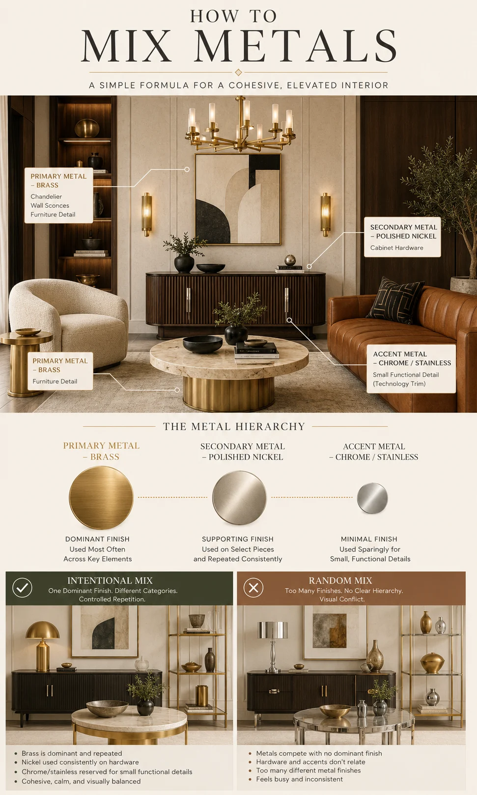
A useful metal hierarchy can be thought of in percentages conceptually, but the exact numbers are less important than the visual reading.
The primary finish should clearly dominate.
The secondary finish should repeat enough to look intentional.
The accent finish should remain genuinely small.
If three metals appear at roughly equal frequency, the room may begin to feel fragmented unless the design is intentionally eclectic.
In a refined Neo Deco room, a practical example might be:
brass as the primary finish, appearing on lighting and selected furniture;
polished nickel as the secondary finish, appearing on a console or hardware;
chrome or stainless steel as a functional accent, appearing only where appliances or technology require it.
The room still reads as warm because brass owns the visual hierarchy.
Matching Metal to Stone Is More Important Than Matching It to a Trend
Stone can strongly influence which metal feels natural because its undertone and veining create a temperature before the fixtures are added.
Warm Cream Stone
Cream limestone, beige marble and warm travertine-like surfaces usually accept brass very easily.
Polished nickel creates a quieter contrast.
Chrome produces the strongest temperature difference.
None is inherently wrong. The decision depends on whether the room should feel blended or sharply defined.
White Marble With Gray Veining
Cooler white marble often supports chrome particularly well because the silver reinforces its crisp character.
Polished nickel softens the combination.
Brass introduces deliberate warmth and can make pale stone feel more decorative or glamorous.
If the stone contains warmer beige or gold veining, brass may feel more integrated than it does beside a blue-gray marble.
Burgundy or Red Marble
Red stone already carries tremendous warmth and visual weight.
Brass amplifies that warmth and creates the richest combination. Polished nickel introduces a controlled silver contrast without pushing the room entirely cool. Chrome creates the sharpest opposition.
This makes the metal choice particularly powerful in a dramatic stone room.
Black Stone
Black stone can support all three finishes because it provides strong contrast.
Brass appears luxurious and graphic.
Polished nickel feels refined.
Chrome becomes bright and highly contemporary.
The larger question is what other materials surround the black stone. Walnut and cognac may suggest brass, while clear glass and white surfaces may favor chrome.
Matching Metal to Timber Changes the Mood Just as Strongly
Timber already brings warmth into an interior, but different woods respond differently to metal.
Walnut + Brass
This is one of the richest pairings.
Both materials contain warm brown or golden tendencies, so the relationship feels naturally cohesive. It works particularly well with cognac leather, burgundy and cream.
This combination is one reason the Neo Deco interior design palette so often relies on walnut and brass.
Walnut + Polished Nickel
Nickel creates a sophisticated contrast without making walnut look orange.
This can be particularly effective in contemporary rooms where the designer wants timber warmth but does not want an obviously gold metal.
Walnut + Chrome
Chrome makes walnut feel warmer by comparison.
The result can be excellent when the design needs a sharper contemporary edge.
Large chrome surfaces may look severe beside very traditional walnut joinery, while small chrome details can provide useful visual relief.
Pale Oak + Brass
Pale oak and brass can become very warm together, particularly under warm lighting.
This can be beautiful but may require a cooler stone, black accent or neutral textile to stop the room from becoming overly yellow.
Pale Oak + Chrome
Chrome introduces stronger contrast and can make light oak feel cleaner and more contemporary.
This relationship works particularly well in minimal interiors where metal should remain crisp.
Lighting Can Change the Metal More Than the Sample Board Suggests
A metal sample should never be selected under one lighting condition only.
Brass becomes warmer under low-color-temperature light. Polished nickel can appear almost champagne-colored beside warm lamps. Chrome will reflect that warm light as well, but its underlying character usually remains sharper.
Natural daylight reveals another side of the finish.
A brass sample beside a window may appear paler than it did under showroom lighting. Polished nickel may read more neutral. Chrome can become extremely bright where the window itself is reflected.
Test the Finish Beside the Actual Materials
Hold the metal sample against the stone, timber, cabinet color or upholstery that will sit beside it.
Then view the combination under daylight and the actual artificial lighting planned for the room.
This simple test can prevent a common problem: selecting each material separately and discovering during installation that their undertones amplify one another in an unintended way.
Watch What Polished Metals Reflect
Highly polished surfaces behave almost like small mirrors.
A beautiful polished nickel lamp may reflect a dark television screen. A chrome table frame can pick up flooring color. Polished brass beside a burgundy wall may appear much redder than the isolated sample suggested.
The surrounding room becomes part of the finish.
This is why material comparison should always happen in context.
Fingerprints and Water Marks Matter More on Highly Polished Finishes
A polished finish shows interaction.
Fingerprints, water spots and cleaning streaks may become more visible because smooth reflective surfaces make small changes in sheen easier to notice.
This applies to polished brass, polished nickel and chrome, although the degree varies with the product, coating and environment.
Brushed surfaces usually disguise handling better because the directional texture already breaks up reflections.
That can make brushed brass particularly practical for frequently touched cabinet pulls and handles.
The maintenance choice should therefore follow the object type.
A highly polished decorative lamp that is rarely touched has a different use pattern from a bathroom faucet operated many times every day.
Do Not Assume the Base Metal From the Finish Name
“Polished nickel” describes the visible finish, not necessarily the entire construction of an object.
“Chrome” may also describe plating applied over another material.
Brass-colored products can be solid brass, plated brass, coated metal or another substrate entirely.
That matters because finish durability, repair possibilities, patina and care instructions depend on the actual product construction.
For important fixtures, read the manufacturer’s specification rather than making assumptions based on the color name alone.
The visual comparison in this article concerns how the finishes behave as design choices. Product performance still needs to be assessed at the individual specification level.
When Brass Is Probably the Better Choice
Brass becomes especially compelling when several of these conditions are present:
the room contains walnut, cognac, terracotta, burgundy or warm stone;
the design needs a visible warm accent;
the desired mood leans toward Neo Deco, classic contemporary or richer residential luxury;
the surrounding palette contains enough matte surfaces to balance metallic reflection;
or the metal itself should become part of the room’s color story.
Brass is less convincing when it is being selected only because gold-colored hardware is currently popular.
If the room’s materials already lean cool and the designer keeps trying to warm them artificially with brass, polished nickel may create a more coherent compromise.
When Polished Nickel Is Probably the Better Choice
Polished nickel is particularly useful when silver is desired but chrome appears too sharp.
It works well with cream, taupe, warm gray, walnut, many white marbles and transitional cabinetry.
It is also a strong option when a room combines warm timber with stainless steel or other silver-colored functional components.
Polished nickel should not be chosen simply because it is perceived as more luxurious than chrome. If the design actually needs the clarity and crispness of chrome, nickel may make the room softer than intended.
The material decision should remain visual rather than status-driven.
When Chrome Is Probably the Better Choice
Chrome becomes especially effective when the room benefits from crisp contrast.
White, black, glass, cooler stone, pale cabinetry and contemporary architecture all support its sharper reflection.
It is also useful where the metal should remain visually lightweight rather than contributing another strong color.
A sculptural chrome object can still become highly visible, so shape matters as much as finish.
Chrome may be less suitable when every other material is intentionally warm and muted. In that environment, its brightness can become the strongest contrast in the room whether the designer intended that or not.
The Best Metal Finish Often Becomes Obvious After the Other Materials Are Chosen
Metal selection is easier when the room already has a clear material direction.
Choose the stone.
Choose the timber.
Choose the principal upholstery or cabinet color.
Understand the lighting.
Then compare brass, polished nickel and chrome against that established palette.
This reverses the common process of selecting hardware early simply because a particular finish is attractive.
A metal sample does not need to be beautiful alone. It needs to make the room around it better.
Common Mistakes When Choosing Interior Metal Finishes
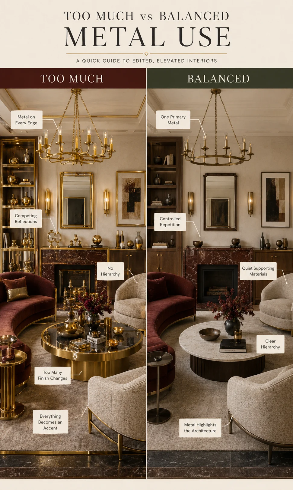
Most metal-finish problems are created before the fixtures are installed. The individual faucet, lamp or handle may be attractive, yet its finish can become disconnected from the materials around it or compete with another metal that was selected independently.
The best way to avoid this is to judge metal as part of the material palette rather than as a final hardware choice.
Mistake 1: Choosing Brass Because the Room Needs to Look Luxurious
Brass can make an interior feel richer, but luxury is not a property of the color gold.
A poorly coordinated brass fitting can look less sophisticated than a simple chrome one. If the room already contains warm timber, burgundy stone, cognac upholstery and amber lighting, adding bright polished brass everywhere may push the palette past richness into saturation.
Ask whether the room needs more warmth before deciding that it needs brass.
Mistake 2: Treating Chrome and Polished Nickel as Identical
They can look similar in online photographs, especially when product imagery uses different lighting.
Put them together under the same light and polished nickel generally appears softer and subtly warmer, while chrome usually reads sharper and more mirror-like.
This difference may be small on one handle. Across a complete bathroom or kitchen, it can influence the room’s overall temperature.
Mistake 3: Mixing Similar Silver Finishes Accidentally
A polished nickel faucet beside chrome handles can work when the distinction appears intentional.
The problem occurs when two nearly identical silver finishes are used on adjacent versions of the same object. One chrome cabinet pull beside an otherwise polished-nickel hardware set often looks like a replacement part rather than thoughtful material layering.
Either match repeated items consistently or separate the finishes by function.
Mistake 4: Comparing Finishes Under Different Lighting
A brass sample under warm showroom lighting and a nickel sample photographed beside daylight cannot be compared accurately.
Place the actual samples next to each other, beside the intended stone or timber, under the lighting expected in the room.
The comparison becomes much more useful when the variables other than metal are controlled.
Mistake 5: Assuming Every Brass Finish Will Age the Same Way
Some brass-colored products are lacquered, plated, coated or otherwise designed to maintain a relatively consistent appearance. Other brass surfaces are intentionally allowed to change.
The visible color alone does not tell you which construction you are buying.
Check the manufacturer’s specification if patina, cleaning or long-term consistency matters to the project.
Mistake 6: Using the Same Metal Everywhere Because Consistency Feels Safe
Consistency is valuable, but complete uniformity is not always necessary.
A home can use brass lighting in a living room and polished nickel plumbing in a nearby bathroom without losing coherence. The materials occupy different environments and perform different jobs.
The more important question is whether each room has a clear metal hierarchy.
Mistake 7: Mixing Metals Without Repetition
One isolated brass object inside a room otherwise filled with chrome can look accidental.
A secondary finish generally needs enough repetition to demonstrate intention. That may mean two brass sconces, a brass lamp and one small furniture detail rather than one unrelated gold object.
Repetition creates the relationship. Quantity alone does not.
Mistake 8: Forgetting Stainless Steel Appliances
A kitchen may already contain a substantial silver metal family before the faucet and cabinet hardware are selected.
Refrigerators, ovens, dishwashers and range hoods can collectively occupy much more visual area than the handles.
Include them on the material board instead of pretending the kitchen begins with the decorative hardware.
Mistake 9: Matching Metal to Style Instead of the Actual Room
“Brass for Art Deco” and “chrome for modern” are useful shorthand, but they are too simplistic for final specification.
A Neo Deco room with cool white stone may benefit from polished nickel. A minimalist kitchen with walnut cabinetry may look excellent with restrained brass.
The material relationship should override the stereotype.
Mistake 10: Assuming the Most Expensive Finish Is the Best Finish
A higher product price does not prove that the finish is visually more appropriate.
Polished nickel may be the right answer in one room and completely unnecessary in another. Chrome may provide exactly the clarity a contemporary bathroom needs.
Select for the room first, then compare products within the appropriate finish family.
Brass vs Chrome vs Polished Nickel – A Final Decision Matrix
| If Your Priority Is… | Usually Start With | Why | Check Before Committing |
|---|---|---|---|
| Warmth and visible metallic color | Brass | Adds an obvious warm gold or amber note to the palette | Whether the room already contains enough warm color |
| Silver with some warmth | Polished nickel | Provides reflective silver without the crispest chrome character | Whether nearby chrome or stainless makes the difference look intentional |
| Crisp reflection and contemporary contrast | Chrome | Creates a bright mirror-like line against glass, white, black and cooler surfaces | Whether that sharp contrast is desirable beside warmer materials |
| Walnut and cognac palette | Brass or polished nickel | Brass reinforces warmth; nickel introduces quieter contrast | Whether the room needs more warmth or more separation |
| White, black and glass palette | Chrome or polished nickel | Both preserve a silver language without introducing obvious gold color | Whether you prefer crispness or softer warmth |
| Mixing metals | Choose one primary finish first | A dominant finish creates hierarchy before secondary metals are added | Whether the secondary finish repeats enough to look deliberate |
The table narrows the decision, but the physical samples should make the final call. A finish that appears perfect in isolation can change substantially when it starts reflecting the actual room.
A Better Process for Choosing the Metal Finish
Step 1: Choose the Materials With the Largest Visual Area
Begin with flooring, cabinetry, major stone, walls and principal furniture.
These surfaces establish the room temperature before the metal appears.
If the room is already strongly warm, decide whether the metal should reinforce that warmth or provide contrast.
Step 2: Identify Metals That Cannot Easily Change
Kitchen appliances, window frames, shower-screen hardware or existing architectural elements may already introduce a metal family.
Record those finishes instead of selecting new hardware as though the project starts from zero.
Step 3: Decide Whether the Metal Should Blend or Contrast
This is the most useful question in the entire process.
If the metal should blend with walnut, cognac and warm stone, brass is a logical starting point.
If the metal should provide silver without feeling overly cold, test polished nickel.
If the room needs a crisp reflective contrast, test chrome.
Step 4: Select the Finish Level
Once the metal family is chosen, compare polished, brushed, satin or other available finish treatments.
The difference between polished brass and brushed brass may influence the room almost as much as the difference between brass and another metal.
Step 5: Compare Samples Beside the Real Materials
Do not compare metals on a white desk unless the finished room is also a white desk.
Place them beside the selected stone, timber, paint, upholstery and tile.
The undertone relationship becomes far easier to judge.
Step 6: Test Daylight and Evening Light
Look at the samples during daylight and after the artificial lighting is switched on.
A finish should support both conditions unless the room is used predominantly at one particular time.
Step 7: Check Reflection
Look at what the polished surface actually reflects.
Windows, black screens, colored walls and nearby stone can all become visible inside the metal.
This is particularly important with chrome and highly polished nickel.
Step 8: Assign Primary and Secondary Metals
If the room mixes finishes, decide which one owns the greater visual area.
Assign the second metal a separate role rather than distributing both randomly.
Step 9: Check Repeated Hardware
A single beautiful handle does not show how twenty-four copies will affect a kitchen.
Lay several samples together or visualize the complete elevation. Repetition increases the apparent importance of even a small item.
Step 10: Read the Actual Product Specification
Confirm the finish construction, care instructions and manufacturer terminology before assuming that two similarly named products will behave identically.
The interior-design decision and the product-performance decision should support one another.
The Answer Is Often Different When the Object Changes
There is no requirement for one preferred finish to win across every object category.
You may love polished brass for a chandelier because it is high above the room, rarely touched and intentionally decorative. The same level of polish may be less appealing on a kitchen pull handled dozens of times every day.
A chrome faucet can feel crisp and appropriate in a bathroom while a chrome chandelier in the adjacent bedroom would feel too cool.
Polished nickel may be ideal for plumbing because it bridges warm stone and a silver palette, while brass remains the better metal for the decorative lighting.
This is why “Which metal should I use in my house?” is usually too broad a question.
The useful decision is which metal should perform this particular job inside this particular material palette?
Brass, Chrome and Nickel Are Finish Descriptions – Product Construction Still Matters
The visible finish and the underlying object are not necessarily the same material.
Decorative nickel plating is used on many manufactured objects because nickel coatings can contribute brightness, appearance and performance. The Nickel Institute’s explanation of nickel plating also notes that nickel is frequently used beneath subsequent coatings, including chromium.
Decorative chrome can similarly involve a layered plating system rather than a solid piece of chromium. The U.S. Environmental Protection Agency’s technical description of decorative chromium electroplating describes decorative chromium as a relatively thin chromium layer applied over nickel to achieve a bright, reflective and resistant surface.
This distinction matters for interior specification because two fittings that both look “silver” can have different substrates, coatings and manufacturer care requirements.
The article’s comparison is therefore primarily about visible interior-design character. Durability, warranty, maintenance and substrate should still be checked for the actual product being purchased.
Compare Local Home Specialists Near You
Tell us what kind of help you need, then compare nearby businesses by location, Google rating, review volume and contact options.
HomeFix Local Match
Turn a home problem into a practical local hiring decision. Check the clues, see the specialist types that fit, open focused surrounding-location searches, then compare the strongest three before you call.
 YOUR PROBLEM
YOUR AREA
COMPARE 3
✓ Ready to compare
YOUR PROBLEM
YOUR AREA
COMPARE 3
✓ Ready to compare
What is happening?
Choose the closest problem type, then check every clue that applies. Your selections change the specialist order.
Where should the search focus?
Use Google’s “near me” context or enter the area you actually want a specialist to serve.
Simple local search: open nearby Google results, choose the businesses that look suitable, then compare your best three here before you call.
Problem snapshot
Who should you call first?
These are the specialist types most likely to fit the clues you selected.
Search around your location
Compare your top three
Use the same factors for each option so a high star rating does not hide a weak scope, poor diagnosis, missing credentials or unclear aftercare.
Comparison result
Your result combines the Google signals you entered with the practical hiring checks you completed.
Questions to ask every finalist
Use the same questions with each shortlisted business so the comparison stays consistent.
Frequently Asked Questions About Brass, Chrome and Polished Nickel
What is the main difference between brass, chrome and polished nickel?
The most visible difference is temperature and reflection. Brass introduces a warm gold or amber color, chrome usually creates the brightest and coolest mirror-like silver appearance, and polished nickel generally sits between them as a softer, slightly warmer silver. The exact appearance still changes according to finish treatment, lighting and surrounding materials.
Is polished nickel warmer than chrome?
Polished nickel commonly appears slightly warmer and softer than chrome when the finishes are viewed under the same conditions. Chrome generally creates a crisper, more mirror-like reflection. Because lighting can alter both surfaces, compare physical samples side by side rather than relying only on separate product photographs.
Does brass look dated?
Brass does not belong to one period or design style. Its effect depends on shape, finish and surrounding materials. Restrained brushed brass beside walnut, stone or contemporary cabinetry can feel very different from highly polished decorative brass used extensively across a room. The design becomes dated more easily when one fashionable treatment is repeated without regard to the architecture.
Which is better for a bathroom, chrome or polished nickel?
Neither finish is universally better. Chrome provides a crisper, cooler and more mirror-like appearance that works naturally with glass, white porcelain and contemporary surfaces. Polished nickel can provide silver reflectivity with a slightly warmer character, which may suit cream stone, warmer marble, taupe and timber more naturally. Product quality and care requirements should be evaluated separately from appearance.
Can brass and chrome be mixed in the same room?
Yes. Brass and chrome create an obvious warm-versus-cool contrast that can look intentional when one finish clearly dominates and the second has a defined role. For example, brass lighting can coexist with chrome furniture or plumbing more successfully than changing metal randomly across otherwise identical hardware.
Can polished nickel and chrome be mixed?
They can, but their similarity requires more care than mixing clearly different metals. Use them on separate object categories or in different parts of the room so the variation looks intentional. Adjacent versions of the same hardware in nickel and chrome are more likely to appear mismatched.
What metal looks best with walnut?
Brass naturally reinforces walnut’s warmth, polished nickel adds a softer silver contrast, and chrome creates the sharpest contemporary opposition. The best choice depends on whether the design should feel warmer, more neutral or more graphic rather than on walnut requiring one specific metal.
Which metal works best with white marble?
All three can work. Chrome reinforces a cool, crisp white marble palette, polished nickel softens the silver relationship, and brass creates deliberate warmth. Look closely at the marble’s actual veining because warm beige or gold movement may respond differently from blue-gray veining.
Does polished brass show fingerprints more than brushed brass?
Highly polished surfaces generally make changes in reflection more visible, so handling marks and streaks may be easier to notice than on a directional brushed surface. The actual behavior depends on the product’s coating and finish system, so frequently touched hardware should be assessed using the manufacturer’s care information rather than appearance alone.
Should all metal finishes match throughout a house?
No. A home can use different metal families in different rooms while remaining visually coherent. It is more important for each space to have a clear hierarchy and for nearby finishes to relate intentionally than for every fixture across the entire home to use one identical metal.