

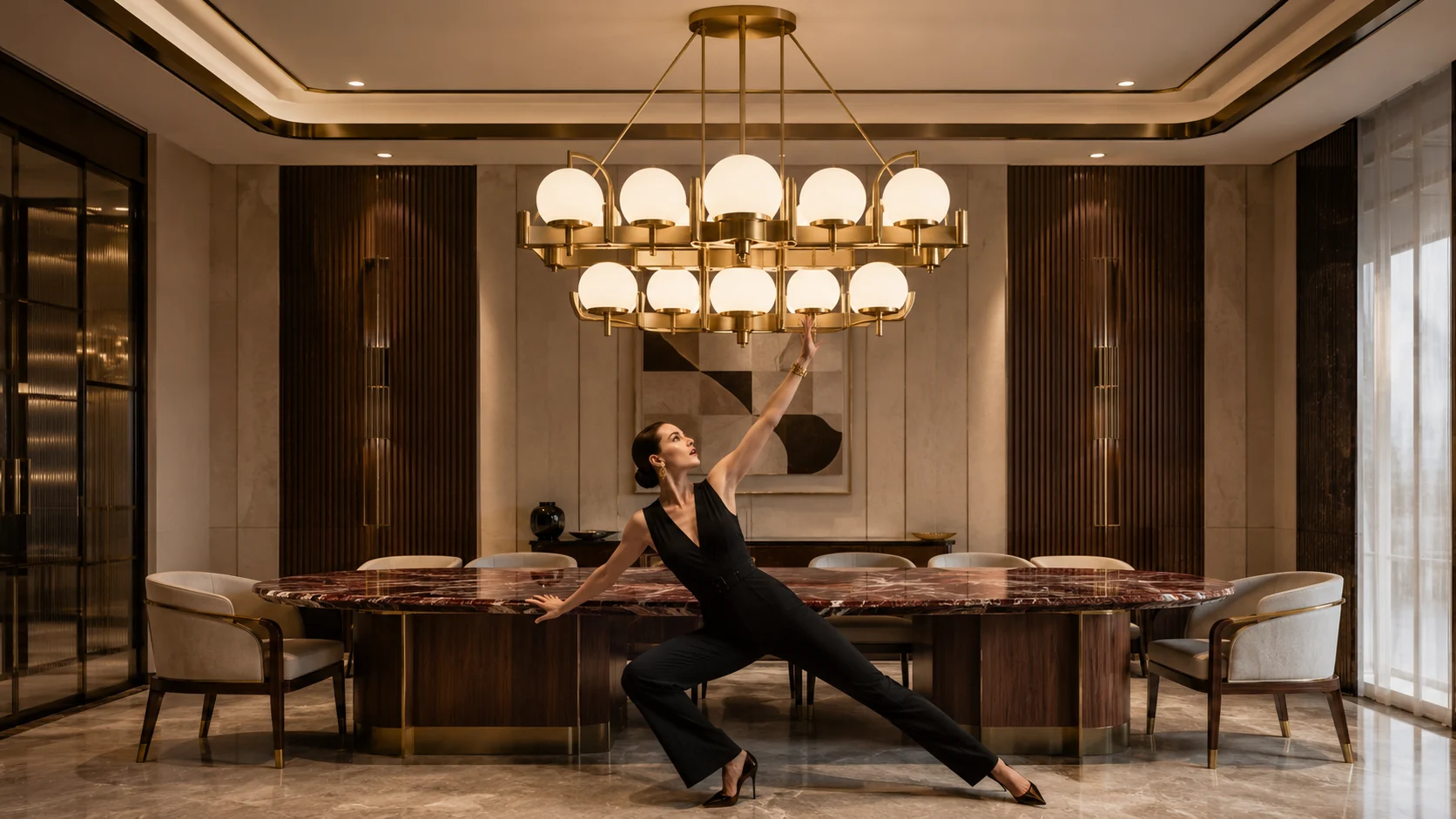

An Art Deco pendant can transform a room because it occupies several design roles at once. It introduces a strong object into the upper part of the composition, creates a relationship with furniture or architecture below, adds another material finish to the palette and influences how people experience the room after dark. That combination also explains why a beautiful fixture can look disappointing once it is installed at the wrong scale or height.
Choosing the pendant by appearance alone is therefore risky. The fixture needs to be considered against what sits below it, how high the ceiling is, where people stand or sit, what the shade reveals, how much light escapes from it and how strongly its metal finish competes with the rest of the room.
Art Deco and contemporary Neo Deco lighting make this especially important because the fixtures are often intentionally sculptural. Opal globes, stepped silhouettes, elongated rods, fluted glass, dark bronze, brass and geometric frames can carry enough visual weight to become the room’s focal point. A fixture that is too small loses that authority, while one that is unnecessarily large can compress the architecture and dominate the furniture.
A useful starting sequence is to choose the lighting job first, establish the visual zone underneath it, determine a suitable fixture scale and hanging position, and only then decide whether the decorative language should lean toward classic Art Deco or a cleaner Neo Deco interior.
Start With What the Pendant Is Supposed to Do
A pendant above a dining table has a different job from a pendant hanging in the center of a living room. A kitchen-island fixture interacts with standing people and task surfaces, while a double-height pendant may function primarily as architecture when viewed from several levels.
Those differences affect almost every specification decision.
A dining pendant can hang relatively low because the table creates a protected zone below it. A pendant in an open walking route needs substantially more clearance because people pass directly underneath. A fixture over an island has to illuminate the work surface without obstructing conversation across it, while a decorative living-room pendant may need enough height to preserve views toward artwork, windows or the television.
This is why the first drawing should show the people, furniture and circulation, not only the ceiling point.
Dining Pendants Belong to the Table Zone
A dining pendant is visually connected to the table rather than to the entire room.
If a long dining table sits slightly off-center within an open-plan space, centering the pendant on the room instead of the table can make the lighting composition feel disconnected. The fixture should generally respond to the table’s axis, length and seating arrangement unless the architecture creates a strong reason to do otherwise.
This principle becomes particularly important with built-in or fixed seating. A room using leather banquette design may place the table asymmetrically relative to the walls so circulation remains comfortable. The pendant should usually follow the actual table rather than forcing the furniture back toward an architectural centerline that does not suit the way the room is used.
Kitchen-Island Pendants Need to Work From Both Sides
Island lighting is seen from the kitchen, dining area and often the living room, which makes pendant spacing and height particularly exposed.
The fixture should provide useful light while maintaining sightlines across the island. An oversized opaque shade can visually divide the room even when the physical island remains open. Small transparent pendants may preserve views beautifully but create another issue if the exposed light source produces uncomfortable glare.
The right island fixture therefore depends on more than the island length. Shade opacity, bulb visibility, fixture width, spacing and the surrounding ambient lighting all change whether the installation feels comfortable.
Living-Room Pendants Should Support the Focal Hierarchy
In a Neo Deco living room, the pendant may need to coexist with a fireplace, large artwork, sculptural seating and expressive stone.
Making the ceiling fixture equally dramatic can work in a generous room with enough architectural volume. In a smaller room, the same strategy may create several focal points competing at once.
Before choosing an elaborate Deco fixture, decide whether the pendant should become the dominant decorative element or reinforce something stronger below. When the sofa, stone and artwork already provide considerable visual movement, a simpler geometric pendant can often make the room feel more resolved.
Art Deco Pendant or Chandelier – What Is the Difference in Practice?
The words pendant and chandelier overlap in contemporary product naming, so the useful distinction is less about terminology and more about how the fixture occupies space.
A pendant commonly reads as one suspended lighting composition, even when it contains several globes or light sources. It can be compact, elongated, linear or sculptural. A chandelier usually extends into multiple arms, branches or repeated elements and therefore occupies more horizontal and visual volume.
For specification purposes, the important question is how much visual territory the fixture claims.
A compact opal-glass pendant can behave as one concentrated object. A multi-arm brass chandelier spreads reflection and light across a much wider zone. Two products with similar listed diameters may therefore feel very different because one is visually dense and the other contains considerable open space.
An Open Fixture Can Feel Smaller Than Its Dimensions Suggest
A 900 mm wide fixture built from thin rods and small globes may feel visually lighter than a 700 mm opaque drum.
This is why fixture diameter alone cannot determine scale.
Material density, glass opacity, frame thickness, number of light sources and the amount of empty space within the silhouette all affect perceived size. A large airy chandelier may sit comfortably above a table where a smaller solid fixture would feel heavy.
A Dense Fixture Needs More Breathing Space
Smoked glass, dark metal, heavy alabaster or a broad opaque shade can create significant visual mass.
When those materials are used in a low room, increasing the physical distance between the fixture and surrounding architecture may improve the composition more than reducing the fixture diameter slightly.
The pendant should be assessed as a three-dimensional object rather than a circle drawn on a reflected ceiling plan.
Size the Pendant to the Furniture Before Sizing It to the Room
One of the most common mistakes is selecting a pendant according to room area while ignoring the furniture immediately beneath it.
A 25-square-meter dining room can contain a narrow six-seat table or a substantial ten-seat table. Those two furniture conditions can require very different fixture proportions even though the room itself has not changed.
The table, island or conversation zone gives the pendant a visual boundary. Once that relationship is convincing, the room dimensions can be used as a second check.
Dining Tables Need a Clear Size Relationship
For a single pendant above a dining table, a fixture roughly around one-half to two-thirds of the table width can be a useful early visual test rather than a universal rule. The exact answer changes with fixture density, table shape, ceiling height and whether chairs at the ends need additional visual clearance.
A very narrow pendant above a broad table can look detached from the furniture. A fixture nearly as wide as the tabletop can make the setting feel compressed, particularly when its shade is opaque or visually heavy.
The most useful check is to view the fixture from normal standing and seated positions. It should appear intentionally related to the table without creating the impression that diners are sitting beneath a ceiling object that barely fits inside the tabletop boundary.
Long Tables Often Need Length More Than Diameter
A long rectangular dining table can make one small central pendant feel isolated even when its diameter seems appropriate.
An elongated linear pendant, a row of repeated globes or two coordinated fixtures may produce a stronger relationship because the light follows more of the table’s length.
The goal is visual distribution rather than filling every centimeter above the furniture. Large spaces between repeated fixtures can preserve rhythm and negative space, while too many small pendants can make the ceiling appear fragmented.
Round Tables Work Naturally With Radial Fixtures
Round tables create a strong center point, which makes them particularly compatible with globe clusters, circular frames and radial Deco compositions.
The fixture does not have to be round. A geometric square or stepped form can create a useful contrast against the table’s curve.
What matters is whether the pendant reads as belonging to the table’s center rather than floating independently within the room.
Art Deco Pendant Size – Practical Starting Points
The following dimensions are design starting points for visual planning rather than building-code requirements. Fixture construction, ceiling height, manufacturer instructions, sightlines and the actual furniture layout can justify moving substantially outside these ranges.
| Installation | Useful Starting Relationship | What Can Justify Going Larger | What Can Justify Going Smaller |
|---|---|---|---|
| Single pendant over dining table | Test a fixture around one-half to two-thirds of table width as an early visual study | High ceiling, open frame, large room volume, visually lightweight glass | Dense opaque shade, narrow table, low ceiling, strong surrounding architecture |
| Long dining table | Relate the illuminated composition to the table length rather than relying on one small central object | Linear architecture, large table, open-plan room, generous ceiling volume | Strong table material, nearby artwork or cabinetry already carrying visual weight |
| Kitchen island | Leave clear visual space at the island ends and distribute fixtures across the usable work zone | Large island, open-frame shades, high ceiling, few surrounding upper cabinets | Busy cabinetry, low ceiling, opaque shades, important sightlines across the island |
| Open living-room pendant | Size against the main seating or architectural zone rather than the entire floor area alone | Double-height volume, restrained furniture, open sculptural frame | Low ceiling, strong fireplace, large artwork or already expressive furniture |
The important variable in this table is visual mass. A larger open brass frame can sometimes feel calmer than a smaller dark opaque shade, which is why catalogue dimensions should be treated as part of the decision rather than the whole decision.
Hanging Height Should Be Set From Eye Level, Not Only From the Ceiling
Pendant height is usually discussed as a dimension from the ceiling, but people experience the fixture from the floor, chairs and surrounding rooms.
A dining fixture may look perfectly centered in elevation yet obstruct faces across the table. An island pendant can technically clear the work surface but still sit directly in an important sightline toward the living room. A high pendant can preserve the view but lose its relationship with the furniture below.
The most useful height study therefore includes a seated eye line, a standing eye line and the architectural view beyond the fixture.
Dining Pendants Can Hang Lower Because the Table Protects the Zone
A common residential starting range places the bottom of a dining pendant roughly 30 to 36 inches above the tabletop, with adjustments made for fixture scale, ceiling height and sightlines.
That range should be treated as a mock-up point rather than a final automatic dimension.
A very large opaque pendant may need to move upward because it blocks people across the table. A slender transparent fixture may be able to hang lower while preserving visibility. Taller occupants, unusually thick shades and decorative elements extending below the main light source can also change what feels comfortable.
Before fixing the cable length, sit at the table and look directly toward every major seat.
A Higher Ceiling Does Not Require the Pendant to Float Near the Ceiling
One of the easiest ways to weaken a dining composition is raising the fixture simply because the room is tall.
The pendant still belongs visually to the table.
A higher ceiling can allow a larger fixture, a longer suspension system or a more dramatic upper composition without necessarily increasing the distance between the table and the fixture by the same amount.
This is especially important with Art Deco lighting because long rods, chains and repeated vertical elements can use the ceiling volume while keeping the illuminated composition connected to the furniture.
Kitchen Islands Need Clear Conversation Sightlines
People routinely talk across an island, which makes the lower edge of the shade particularly important.
A large row of dark pendants can form a visual wall across the kitchen even when there is ample physical clearance below them. Transparent globes can preserve openness, although exposed light sources may create more glare at eye level.
Mocking up the shade dimensions with cardboard or temporary objects can reveal this problem before electrical work is finalized.
Ceiling Height Changes the Fixture’s Proportion Before It Changes the Style
A fixture that looks impressive beneath a three-meter ceiling can become compressed beneath a lower one or visually insignificant inside a double-height volume.
The relationship involves the entire vertical composition:
ceiling -> suspension -> fixture body -> furniture -> floor
If one part becomes unusually large or small, the other elements need to respond.
Lower Ceilings Favor More Controlled Vertical Depth
A room with a lower ceiling can still support an expressive Art Deco pendant.
The fixture may need to achieve drama through width, geometry, glass and metal detail rather than a long vertical drop. Flush-mounted Deco-inspired fixtures and semi-flush designs can also preserve the decorative language where a conventional pendant would intrude into the occupied zone.
A wide opal-glass composition with a shallow drop may communicate the style more successfully than a narrow pendant hung excessively high simply to create clearance.
Standard Residential Ceilings Offer the Most Flexibility
With moderate ceiling height, the designer can usually choose among compact chandeliers, globe clusters, stepped pendants and linear compositions as long as the furniture relationship remains convincing.
This is the condition where catalogue images can be particularly misleading because many products appear without enough room context to reveal their actual scale.
Check the complete overall height as well as the fixture diameter. Ceiling canopy, rods, chains and decorative drops can add substantial vertical length beyond the dimensions of the visible shade.
Double-Height Rooms Need Enough Visual Weight
A small pendant can disappear inside a tall void even when it would look substantial in an ordinary room.
Double-height interiors may benefit from multi-level compositions, cascading globes, longer vertical geometry or significantly larger open-frame fixtures. The pendant can become an architectural element viewed from the ground floor, upper landing and external windows.
This is one of the few conditions where deliberately oversized lighting can improve the perception of scale rather than making the room feel crowded.
One Large Pendant and Several Small Pendants Produce Different Architecture
Replacing one large pendant with three small ones is not simply another way to achieve the same amount of light.
A single fixture establishes one dominant center. Repeated fixtures create rhythm and extend the composition horizontally. The choice changes how the ceiling relates to the furniture below.
One Large Pendant Creates a Strong Focal Point
A single fixture works particularly well above round tables, compact rectangular tables and rooms where the lighting should behave as one sculptural object.
The design can be expressive because there are no neighboring pendants repeating the same statement.
This approach also makes the metal finish more important because one large brass or polished-nickel object may occupy considerably more visual area than several small fittings. The deeper brass vs chrome vs polished nickel comparison becomes useful when the fixture finish begins affecting how walnut, stone, glass and surrounding colors read.
Repeated Pendants Create Rhythm Across Long Surfaces
Two or three pendants can suit long islands and dining tables because the composition follows the furniture’s horizontal direction.
Spacing should be judged by the complete group rather than by equal mathematical gaps alone. A fixture with a broad shade needs more negative space around it than a narrow cylinder or small globe.
The outer pendants also need enough distance from the ends of the table or island that they feel contained within the furniture zone rather than slipping visually beyond it.
Too Many Small Pendants Can Make the Ceiling Busy
A long island does not automatically require several lights.
If each pendant contains decorative brass, fluted glass and multiple internal details, repeating it four or five times can make the ceiling more visually active than the cabinetry or stone below.
A larger linear fixture may create a calmer result because the eye reads it as one composition.
Art Deco Geometry Should Come From the Fixture Structure
Art Deco lighting is often reduced to gold metal and globe shades, but geometry is usually more important than either feature.
Stepped profiles, repeated vertical lines, fan-like arrangements, symmetrical branches, stacked discs and controlled curves can establish a Deco relationship even when the fixture uses silver metal or clear glass.
This provides much more flexibility than trying to reproduce a historical chandelier exactly.
Globes Work Best When Their Arrangement Has Structure
Opal globes are highly compatible with Deco and Neo Deco interiors because their simple geometry can be repeated without becoming overly ornamental.
The arrangement determines whether the fixture feels contemporary or nostalgic.
Globes positioned around a disciplined horizontal frame can feel architectural. Irregular clusters can feel softer and more contemporary. A highly symmetrical radial arrangement pushes the design closer to classic Deco formality.
Vertical Rods Reinforce Height
Long rods can exaggerate ceiling height and create a strong architectural rhythm.
They are particularly effective in stair voids, double-height living rooms and formal dining areas where the fixture can be viewed from a distance.
In lower rooms, the same vertical language can be compressed into short repeated bars or shallow stepped geometry so the Deco relationship remains visible without consuming excessive headroom.
Curves Need a Geometric Counterpoint
A room already containing a curved sofa, rounded chairs and an oval table may not need another strongly circular lighting composition.
A more structured pendant can provide useful contrast.
This follows the same principle used throughout Neo Deco living-room design: curves gain more impact when rectilinear architecture or structured geometry gives them something to work against.
Glass Opacity Changes Both the Light and the Visual Weight
Two pendants with the same dimensions can behave very differently if one uses clear glass and the other uses opal, smoked or heavily textured glass.
Clear glass preserves sightlines and allows the internal lamp, socket and supporting structure to remain visible. It can make a relatively large pendant feel lighter because the eye continues through the fixture toward the room beyond. The tradeoff is that the light source becomes more exposed, so lamp shape, brightness and viewing angle become part of the design rather than hidden technical details.
Opal glass produces a more visually solid object, but it can also soften the appearance of the light source and create the luminous globe effect associated with many Art Deco and Neo Deco interiors. Smoked glass moves in another direction by introducing darker reflection and greater visual depth, particularly when paired with brass, blackened metal or walnut.
The shade should therefore be selected according to what the fixture needs to reveal, what it needs to conceal and how much visual mass the ceiling can comfortably support.
Clear Glass Preserves the Architecture Behind It
Clear glass works well when the pendant hangs in front of an important view, open-plan connection or decorative wall.
Because the shade does not create a broad opaque block, large fixtures can sometimes remain visually light enough for relatively modest rooms. The supporting metal frame becomes more important, however, because every rod, socket and connection remains visible.
This means inexpensive-looking internal hardware becomes harder to hide.
A beautifully designed clear-glass pendant should look resolved from the underside as well as from normal standing height. If the fixture is visible from a staircase or upper floor, the internal construction becomes even more important.
Opal Glass Can Make the Light Source Part of the Form
Opal globes and diffusing shades allow the illuminated surface itself to become the decorative object.
This works especially well with Art Deco geometry because repeated glowing forms can reinforce symmetry without requiring elaborate ornament.
An opal globe cluster can appear calm when switched off and significantly more sculptural after dark. The fixture therefore needs to be assessed in both conditions rather than chosen only from a daytime product photograph.
Large opaque globes also carry more visual mass than clear equivalents. If several are grouped together, their combined volume can make the fixture feel substantially larger than its metal frame dimensions suggest.
Smoked Glass Adds Depth but Can Become Visually Heavy
Smoked glass can look sophisticated beside walnut, dark stone, burgundy and black lacquer because it extends the room’s darker material language into the lighting.
It is particularly effective when the fixture should feel architectural without using a large amount of solid metal.
The darker the glass becomes, however, the more important the actual light output and surrounding lighting layers become. A pendant should not be expected to provide all of the room’s illumination simply because it occupies the visual center.
This is where decorative and functional lighting need to be separated conceptually.
Visible Bulbs Change the Design More Than Many Buyers Expect
When a pendant uses clear glass or an open frame, the lamp becomes part of the visual composition.
Its shape, size, filament appearance and brightness can alter the fixture dramatically. A carefully proportioned Deco pendant can lose much of its refinement if the lamp protrudes awkwardly below the shade or produces a point of brightness that dominates the entire object.
The problem becomes particularly noticeable when multiple exposed lamps are repeated.
One uncomfortable bright point may be manageable. Six or eight visible lamps distributed across a chandelier can create considerably more visual intensity at normal eye level.
Check the Pendant From the Seated Position
Dining fixtures are often photographed from standing height, but diners experience them while sitting.
From that lower position, the underside of the fixture becomes more visible. A lamp that appeared hidden behind a glass shade in the showroom may become directly visible across the table.
This is one of the reasons a physical mock-up or installed sample is valuable for important dining spaces.
The fixture should still look composed when viewed between people rather than only from the room entrance.
Decorative Lamps Should Still Serve the Lighting Design
A decorative lamp shape can be attractive without necessarily creating the best illumination for the room.
If the pendant depends heavily on visible lamps, treat those lamps as one component of the overall lighting system rather than expecting them to perform every ambient and task requirement.
Wall lights, concealed lighting, floor lamps or downlights can carry other jobs so the pendant does not need to become excessively bright.
That separation often makes the decorative fixture more comfortable and visually convincing.
Art Deco Pendant Lighting Works Best as Part of a Layered Lighting Plan
A beautiful pendant cannot correct a room that has no other useful light.
Dining rooms benefit from background illumination so the table does not appear as one bright island surrounded by darkness. Kitchens need task lighting at work surfaces. Living rooms usually need lower-level light from lamps or architectural sources to create depth after sunset.
The pendant should therefore be assigned a clear role.
It may provide useful table light, establish the main decorative focal point, create ambient glow or perform several of those jobs at once. What it should not do is become the only solution simply because it is the most expensive fixture in the room.
Use the Pendant as the Decorative Anchor
If the pendant is highly expressive, surrounding lighting can become quieter.
Simple wall lights, restrained downlights or concealed architectural sources can support it without repeating the same decorative language.
This creates hierarchy.
A room containing an ornate pendant, equally ornate sconces, sculptural floor lamps and several decorative table lamps can lose the sense that any one fixture deserves attention.
Use Wall Lighting to Extend the Composition Horizontally
Pendant light draws attention toward the center of the ceiling or furniture zone.
Wall lighting can counterbalance that concentration by illuminating architecture, artwork or vertical surfaces around the room.
In an Art Deco interior, a pair of symmetrical sconces can reinforce geometry without competing directly with the pendant. In a more contemporary Neo Deco room, asymmetrical wall lighting may provide enough visual tension to prevent the composition from becoming excessively formal.
The pendant and wall lights do not have to match as a product family. They need to feel related through proportion, material or geometric language.
Use Concealed Light When the Architecture Needs to Remain Quiet
Cove lighting or integrated joinery light can provide background illumination without adding another visible fixture.
This is useful when the ceiling pendant already carries strong geometry.
The concealed source should remain subordinate rather than creating bright linear effects that compete with the decorative light. The architecture should appear illuminated, not outlined like a graphic.
Dimming Becomes More Important as the Pendant Becomes More Decorative
A dramatic pendant may need to perform very differently during dinner, cleaning, entertaining and daytime use.
One fixed output can make that difficult.
A dimmable lighting strategy allows the pendant to remain visually active without requiring it to operate at maximum brightness whenever the room is occupied. It also allows surrounding layers to become more important in the evening, which can substantially change the mood of stone, timber, glass and metallic finishes.
The control system should be considered when the fixture is specified rather than after installation. Lamp type, driver compatibility, fixture construction and the chosen controls need to work together.
Separate Decorative and Architectural Lighting Where Practical
If a dining pendant and surrounding downlights are controlled together, reducing one automatically reduces the other.
Separate control allows the pendant to glow more gently while architectural lighting maintains useful room illumination, or the reverse when stronger table light is needed.
The same principle applies to kitchen islands. Decorative pendants, under-cabinet task lighting and general ceiling light perform different jobs and benefit from independent adjustment.
The goal is not to create a complicated control system. It is to prevent unrelated lighting layers from being forced into the same brightness condition.
Metal Finish Becomes More Important as the Fixture Gets Larger
A cabinet pull may contain only a small amount of metal. A pendant can place hundreds of millimeters of brass, chrome, polished nickel, bronze or blackened metal directly in the viewer’s central field of vision.
That scale amplifies undertone.
Brass can noticeably warm walnut, cream stone and cognac upholstery. Polished nickel can introduce a softer silver contrast. Chrome creates a cleaner, brighter relationship with glass, black and pale surfaces.
The larger the fixture, the more carefully that finish should be coordinated with the rest of the material palette.
Brass Creates the Strongest Classic Deco Association
Brass is particularly effective when the pendant includes opal glass, stepped geometry, dark timber or richly colored stone.
The relationship can become obvious quickly, which is why the quantity of brass elsewhere in the room should remain controlled.
If the chandelier is already the largest metallic object, every table leg, cabinet pull and mirror frame does not need to repeat the same finish at equal intensity.
A stronger composition often allows the pendant to own the brass statement while smaller details support it more quietly.
Polished Nickel Can Make Deco Feel More Metropolitan
A silver-toned Art Deco fixture does not stop being Deco.
Polished nickel can make geometric forms feel cleaner and slightly less nostalgic, particularly beside cream plaster, walnut, pale marble and black lacquer.
It is useful when the room needs the refinement of reflective metal without introducing an obvious golden color.
For a detailed comparison of undertone and reflection, the brass vs chrome vs polished nickel guide explains how the same finish changes beside walnut, stone, glass and different lighting conditions.
Chrome Pushes the Fixture Toward a Crisper Contemporary Direction
Chrome emphasizes reflection and precision.
It can work especially well with clear glass, black lacquer, white plaster and more streamlined Deco geometry. The combination often feels closer to contemporary luxury than to a historical revival.
Chrome becomes very bright when it reflects windows or pale surfaces, so large chrome fixtures deserve careful assessment in daylight.
A fixture that looks controlled under showroom lighting may appear considerably more reflective once installed beside a large window.
Blackened Metal Can Let the Geometry Speak More Quietly
Not every Art Deco pendant needs a visibly precious metal finish.
Blackened or very dark metal can emphasize the silhouette without introducing additional warmth or reflection. This is useful when the room already contains brass elsewhere or when stone and furniture should remain dominant.
The dark frame can also provide strong contrast against opal glass.
In a room with dark ceilings or walnut panels, however, the same fixture may visually recede more than expected.
Do Not Match Every Metal Simply Because the Pendant Is Brass
A brass pendant does not require brass on every other fixture.
Metal coordination becomes more sophisticated when one finish clearly dominates and another has a defined secondary role. A brass chandelier can coexist with polished nickel door hardware, stainless appliances or a small chrome furniture detail when those elements are separated by function and scale.
The important distinction is between intentional variation and accidental near-matching.
A polished nickel wall light immediately beside a chrome pendant may look like an unsuccessful attempt to match silver finishes. A brass pendant above a dining table and polished nickel fittings in an adjacent kitchen can read clearly as different functional zones.
Metal hierarchy remains more useful than complete uniformity.
The Ceiling Can Change Whether the Pendant Looks Expensive
The pendant does not float independently of the ceiling plane.
A beautifully designed fixture attached to an undersized canopy, poorly coordinated junction point or visually awkward cable arrangement can lose much of its architectural presence.
The connection at the ceiling deserves almost as much attention as the shade or frame below.
The Canopy Should Relate to the Fixture
A large sculptural pendant hanging from a tiny generic canopy can make the upper connection feel unresolved.
A larger canopy may help integrate multiple suspension cables, transformers or decorative rods, but it should still relate to the ceiling architecture.
Decorative ceilings with mouldings, coffers or recessed panels may require a carefully positioned mounting zone rather than simply installing the pendant at the geometric center of the room.
Multiple Pendants Need a Deliberate Ceiling Strategy
Three pendants can be mounted from individual canopies or organized through one larger ceiling plate.
Those approaches look very different.
Separate points create rhythm across the ceiling. A shared canopy makes the group read more clearly as one fixture.
The best choice depends on whether the design should emphasize repetition or unity.
Long Cables Should Look Intentional
In high spaces, suspension cables and rods become significant visual elements.
A black cable, brass rod or clear electrical cord changes the fixture’s vertical line. If multiple pendants are hung at different heights, these lines can create almost as much pattern as the shades themselves.
Do not treat suspension hardware as invisible simply because the product photography focuses on the decorative body.
Pendant Placement Should Follow Furniture That Will Actually Stay Put
Lighting layouts sometimes assume furniture will remain exactly centered forever.
That is reasonable for fixed islands and built-in dining arrangements, but more flexible rooms require a different approach.
A pendant placed over the geographic center of an open living room may become awkward if the seating shifts. A low dining pendant effectively commits the table to one location because moving the furniture exposes the fixture as a hanging obstacle.
This is not necessarily a disadvantage.
A strong lighting position can help organize a room, but the commitment should be understood before electrical points are finalized.
Fixed Furniture Allows More Precise Pendant Placement
Kitchen islands, built-in banquettes and permanent dining joinery provide reliable reference points.
The fixture can be centered accurately on the furniture because the relationship is unlikely to change.
This allows lower hanging heights and more dramatic scale because the protected zone remains predictable.
Flexible Living Rooms Need More Clearance
A central living-room pendant should generally allow greater flexibility because coffee tables and seating are more likely to move.
The fixture can still align with the primary furniture group, but its lower edge should not depend on one movable table being present forever.
That difference between fixed and flexible furniture is one of the most practical distinctions in pendant planning.
Small Rooms Need One Clear Lighting Gesture
A small dining room does not necessarily require a tiny pendant.
One substantial fixture can actually make the space feel more intentional because the eye reads a clear focal point instead of several undersized decorative elements.
The key is controlling vertical depth and visual density.
A wide open-frame fixture or shallow globe composition may provide presence without blocking views. A smaller but extremely dense black or smoked-glass fixture may feel heavier even though its catalogue dimensions are technically more modest.
Avoid Shrinking Every Element
A tiny table, tiny pendant, tiny artwork and tiny accessories can make the scale of a compact room feel hesitant.
Choose one or two elements with enough visual confidence to establish hierarchy.
The pendant is often a good candidate because it uses ceiling volume without consuming additional floor area.
Keep the Surrounding Ceiling Quiet
If the decorative pendant is already strong, excessive downlights, tracks and ceiling details can make a small ceiling feel crowded.
Coordinate required lighting carefully and allow some uninterrupted ceiling area around the main fixture.
The visual breathing space helps the pendant appear intentional rather than squeezed into the only remaining opening.
Large Rooms Need Distribution as Well as Scale
A large room can make a dramatic pendant possible, but size alone does not solve the lighting plan.
One giant chandelier may provide a powerful center while leaving the edges visually disconnected. Secondary lighting, architectural illumination or additional functional zones may still be necessary.
This becomes particularly important in open-plan interiors where dining, living and kitchen functions share one ceiling field.
Each zone can have a distinct lighting identity without becoming a competition of statement fixtures.
Choose Which Zone Owns the Strongest Pendant
If the dining room contains the most decorative chandelier, the kitchen island pendants can become simpler.
If the island is the architectural centerpiece, the dining lighting may be more restrained.
Giving every zone an equally elaborate fixture can create a ceiling full of focal points rather than one coherent interior.
The hierarchy should remain visible from the main entrance to the open-plan space.
Repeat a Design Language, Not Necessarily the Same Fixture
Using exactly the same pendant everywhere can feel commercial or overly coordinated.
Instead, repeat one characteristic.
A dining fixture may use opal globes and brass, while the island uses simpler opal cylinders with the same metal. Another project might repeat stepped geometry but change the glass.
The rooms feel related because the visual language continues without becoming repetitive.
Art Deco Pendant Lighting Mistakes That Change the Whole Room
Mistake 1: Choosing the Fixture Before the Table
The pendant may be beautiful, but its scale has no reliable reference until the furniture below is known.
Select or at least establish the table dimensions first.
Mistake 2: Centering the Pendant on the Room Instead of the Furniture
This creates a particularly obvious problem in open-plan or asymmetrical layouts.
The fixture should usually belong to the furniture zone it serves.
Mistake 3: Hanging a Dining Pendant Too High
Raising the pendant toward the ceiling can disconnect it visually from the table.
Higher ceilings do not automatically require the illuminated body to move far away from the furniture.
Mistake 4: Hanging an Opaque Fixture Directly in the Sightline
A technically acceptable clearance can still create an annoying visual barrier.
Check the actual seated and standing views.
Mistake 5: Selecting Only by Diameter
Visual density, opacity and internal complexity matter as much as width.
A smaller solid fixture can feel heavier than a larger open one.
Mistake 6: Repeating Too Many Small Pendants
Several decorative fixtures create considerable rhythm and visual activity.
One larger linear composition may sometimes produce a calmer result.
Mistake 7: Ignoring the Lamp Inside Clear Glass
When the bulb is visible, it becomes part of the design.
Its shape and brightness should be considered with the fixture rather than purchased as an afterthought.
Mistake 8: Expecting the Pendant to Light the Entire Room
Decorative lighting works better when supported by appropriate ambient, task or accent layers.
The pendant does not need to carry every lighting function.
Mistake 9: Using Too Many Statement Fixtures in One Open Plan
Dining, kitchen and living areas can each contain decorative lighting without every fixture becoming equally dominant.
Assign hierarchy between zones.
Mistake 10: Forgetting the Ceiling Connection
Canopies, rods, cables and junction positions remain visible.
A beautifully proportioned shade cannot fully compensate for an unresolved installation above it.
A Practical Art Deco Pendant Selection Sequence
Step 1: Define the Furniture or Activity Zone
Establish the exact table, island, seating group or architectural area the fixture will serve.
Check whether that furniture is fixed or likely to move.
Step 2: Decide the Pendant’s Lighting Job
Determine whether it primarily provides decorative presence, useful table illumination, ambient glow or a combination.
Do not assume one fixture needs to perform every lighting function.
Step 3: Establish the Useful Visual Width
Compare fixture width with the furniture beneath it.
Use dimension guides only as a starting study and account for how open or dense the fixture actually appears.
Step 4: Study the Vertical Section
Draw or mock up the ceiling, suspension, fixture, furniture and eye lines.
A reflected ceiling plan alone cannot reveal whether the fixture blocks conversation or views.
Step 5: Choose One Fixture or a Repeated Composition
Decide whether the room benefits from one strong focal object or horizontal rhythm.
For repeated pendants, evaluate the group as one composition.
Step 6: Select Glass Opacity
Choose clear glass when openness and visibility through the fixture are priorities.
Choose opal or diffusing glass when a more luminous solid form is desirable, and use smoked glass when greater depth is compatible with the lighting plan.
Step 7: Select the Metal Against Real Materials
Compare brass, nickel, chrome, bronze or dark metal beside the actual timber, stone, cabinetry and upholstery.
The metal should improve those materials rather than simply look attractive by itself.
Step 8: Resolve the Ceiling Hardware
Confirm canopy size, suspension method, ceiling position and any additional structural or electrical requirements before installation.
Step 9: Coordinate the Other Lighting Layers
Decide what wall, task, architectural and background lighting will support the pendant.
Prevent every visible fixture from competing at the same decorative level.
Step 10: Mock Up the Final Height Before Cutting Cables or Rods
Temporary adjustment is much easier than altering a completed installation.
View the fixture from seated, standing and adjacent-room positions before confirming its final suspension length.
A few minutes spent testing the actual sightline can prevent the most visually disruptive pendant-lighting mistakes.
Choose the Pendant Differently for Each Room
The same Art Deco pendant should not be specified automatically for a dining room, kitchen island, bedroom and living room simply because the design language is consistent. The fixture’s relationship with people changes from room to room, and that changes the acceptable scale, drop, shade opacity and amount of decorative detail.
Dining rooms usually offer the greatest freedom because the table protects the area beneath the fixture. Kitchen islands require stronger attention to task lighting and cross-island sightlines. Living rooms need enough clearance for flexible furniture arrangements, while bedrooms usually benefit from quieter fixture proportions because the pendant is frequently viewed from a lower reclining position.
The room type therefore modifies the lighting strategy even when the same Art Deco vocabulary continues throughout the home.
Dining Rooms Can Support the Strongest Statement
The dining table naturally gives a pendant a visual foundation, making this one of the easiest locations for a larger decorative fixture.
A sculptural brass frame, opal-glass cluster or stepped composition can become the dominant object without appearing arbitrary because the furniture below establishes a clear center. The table also keeps circulation away from the lowest point of the fixture, allowing the pendant to hang closer to furniture than would be practical in an open walkway.
The strongest dining compositions still preserve hierarchy. If the table itself uses highly veined stone and the chairs have strong sculptural forms, the pendant may need to become simpler even when the ceiling volume could physically support something larger.
Kitchen Islands Need More Visual Discipline
Island pendants repeat quickly, particularly when two or three fixtures are installed across one surface.
A decorative feature that looks subtle as one pendant can become much stronger when repeated. Fluted glass, brass frames and globe clusters therefore need to be assessed as a complete sequence rather than as individual products.
Also consider the kitchen beyond the island. Cabinet hardware, appliance finishes, faucets and range hoods may already introduce several reflective surfaces. A heavily metallic pendant can push the composition beyond the intended material hierarchy even when the fixture itself is attractive.
Living Rooms Need Flexible Clearance
A living-room pendant usually lacks the permanently protected zone created by a dining table.
Coffee tables can move, sofas may be rearranged and circulation routes can evolve over time. The fixture should therefore remain visually related to the conversation area without becoming dependent on one movable object remaining directly below it.
This often means using greater clearance or placing the decorative body higher than a dining fixture. The pendant can still feel substantial through width, repeated globes, material contrast or ceiling detailing rather than excessive vertical drop.
Bedrooms Usually Benefit From Reduced Visual Density
A bedroom pendant can introduce Deco character without becoming as theatrical as a formal dining fixture.
A shallow opal-glass composition, restrained stepped form or compact brass-and-glass pendant may provide enough identity while keeping the ceiling calmer. This becomes particularly important when the room already contains upholstered headboards, bedside lighting, curtains and decorative wall treatments.
View the fixture from the bed before finalizing it. A ceiling object that appears elegant from the doorway may feel considerably larger when viewed while lying beneath it.
Pendant Lighting Above a Dining Table Needs More Than a Center Point
Dining-table lighting is often reduced to one instruction: center the pendant over the table.
That is only the beginning.
The fixture also needs to respond to table width, table length, chair positions, ceiling volume and the primary viewing directions through the room. An installation can be technically centered and still feel uncomfortable because the light hangs too low over the end seats, visually compresses the tabletop or interrupts a view toward artwork.
A stronger approach treats the dining table and pendant as one vertical composition.
Check the End Seats
End chairs experience the pendant differently from side chairs.
A long fixture extending close to both ends of a table may look impressive from the room entrance but feel visually crowded when somebody sits at the head position. The outer edges of the lighting composition should normally remain clearly contained within the table zone.
This does not require every pendant to become dramatically shorter than the table. Open frames and narrow rods can extend farther visually than broad opaque shades because they preserve more sightline.
Coordinate the Pendant With the Table Base
The ceiling fixture and table base can either reinforce or fight the same geometry.
A round pedestal table beneath a circular globe cluster produces strong radial alignment. A rectangular stone table with a linear Deco pendant reinforces the long axis. A curved table beneath a rectilinear pendant introduces deliberate tension.
None of these relationships is inherently superior.
The question is whether the contrast or repetition is intentional enough that the two objects read together.
A Stone Table May Need a Quieter Pendant
Highly veined marble already creates movement across a large horizontal surface.
Placing a complex pendant directly above it can produce two strong patterns occupying the same focal zone. A simpler fixture with clean opal globes or restrained metal lines may allow the stone to remain dominant.
This principle is particularly useful when the room contains burgundy or strongly patterned marble similar to the surfaces discussed in red marble bathroom design. Although the application is different, the material hierarchy is the same: expressive stone usually benefits from a quieter supporting surface nearby.
Kitchen-Island Pendant Spacing Should Be Read as a Group
There is no single universal spacing number that solves every island.
Fixture diameter, island length, shade width, cabinet alignment and whether the pendants are visually open or solid all affect how much space feels appropriate between them.
Instead of beginning with equal distances, sketch the complete group at scale.
The outer fixtures should feel comfortably contained within the island. The spaces between fixtures should remain large enough that each pendant can be recognized individually, unless the intention is for several pieces to merge into one continuous composition.
Two Pendants Create a Stronger Pair
Two relatively large fixtures can provide a calm composition above a medium or large island.
The space between them becomes part of the design, and each pendant has enough visual territory to appear deliberate.
This solution can work especially well with large opal globes, stepped shades or substantial Deco forms that would become overwhelming if repeated three or four times.
Three Pendants Create More Rhythm
Three fixtures establish a stronger sequence and can suit a longer island.
The central pendant naturally reinforces the middle of the composition, which can be useful when the sink, cooktop or architectural alignment also occupies that position.
Three decorative fixtures create more visual activity than two, so individual shades may need to become simpler or slightly smaller.
One Linear Pendant Can Create the Calmest Ceiling
A long fixture may solve the same spatial problem without introducing multiple ceiling points.
This can be particularly effective in kitchens already containing numerous downlights, sprinklers, vents or other ceiling elements. One deliberate linear object may reduce apparent clutter.
Linear Deco lighting can still carry considerable character through stepped geometry, repeating globes, brass bars or fluted glass without requiring several separate pendants.
Think About Glare Before Choosing Transparent Glass
Transparent lighting can appear visually weightless in photographs, but it exposes the lamp and internal light source more directly.
The issue becomes most noticeable when the fixture sits near eye level, as dining and island pendants often do.
A light source can be bright enough to attract attention even when the overall room does not feel particularly illuminated. If people repeatedly see the source directly while sitting or standing, the pendant may become less comfortable than its appearance suggested during selection.
Diffusion Can Be More Valuable Than Transparency
Opal glass, frosted glass and other diffusing materials reduce how clearly the lamp itself is seen.
This allows the shade to become the luminous surface rather than the bulb remaining the brightest object.
The result often works particularly well with Deco globe forms because the light reinforces the geometry instead of revealing a separate lamp shape inside it.
Clear Glass Needs a Deliberate Lamp
If clear glass is central to the design, select the lamp at the same time as the fixture.
Check the physical length, shape, filament visibility and position inside the shade. A lamp that protrudes below the intended visual line can change the entire silhouette.
The pendant should be judged illuminated and unilluminated because the internal hardware becomes part of the object in both conditions.
Smoked Glass Needs Supporting Light
Smoked shades can create sophisticated reflections, but they may also reduce the apparent brightness of the illuminated form.
That is not necessarily a problem if other lighting layers are available.
It becomes a problem when the decorative pendant is expected to carry most of the functional room light while the shade has been selected primarily for its dark appearance.
Lighting Controls Should Be Planned With the Pendant
A decorative pendant becomes much more versatile when its output can respond to different uses of the room.
Dining may require brighter illumination while food is being served and substantially softer light later in the evening. Kitchen islands need enough light for preparation but may become a background feature after the cooking is finished. Living-room pendants often work best at a lower level once table lamps and architectural lighting are active.
The U.S. Department of Energy’s lighting-controls guidance explains why controls are an important part of lighting-system performance rather than a decorative afterthought. For an interior project, the practical implication is simple: confirm the compatibility of the fixture, lamp or LED driver and control system before installation.
A beautiful pendant that cannot dim smoothly in the intended control environment can become less useful than a simpler fixture that integrates properly with the complete lighting plan.
Do Not Assume Every LED Fixture Dims the Same Way
Integrated LED pendants may contain drivers with specific control requirements.
Replaceable LED lamps can introduce another layer because the lamp and dimmer also need to work together.
Check the actual manufacturer’s documentation before ordering the final control hardware. The visual design of the pendant does not reveal its electrical compatibility.
Separate Lighting Layers When the Room Needs Different Moods
A dining pendant, wall sconces and concealed lighting do not necessarily need to operate together.
Independent control allows one layer to become dominant while another recedes.
This can be particularly useful in Neo Deco interiors where polished stone, smoked glass and metallic finishes change significantly as the balance between direct and indirect illumination changes.
Art Deco Pendant Lighting by Style Direction
Art Deco lighting does not require one fixed historical appearance.
The same geometric principles can be interpreted through several material directions, allowing the fixture to fit the architecture rather than forcing the entire room toward a period reproduction.
| Style Direction | Pendant Characteristics | Supporting Materials |
|---|---|---|
| Classic Deco | Strong symmetry, stepped geometry, radial arms, opal glass and visible warm metal | Dark timber, rich stone, lacquer, velvet and patterned surfaces |
| Neo Deco | Simplified geometry, larger sculptural forms, fewer decorative details and controlled brass or nickel | Walnut, cream plaster, cognac upholstery, burgundy stone and smoked glass |
| Contemporary Deco | Linear forms, clear glass, chrome or polished nickel and stronger visual contrast | White stone, black lacquer, pale upholstery, glass and clean architectural planes |
| Soft Deco | Rounded globes, diffused light, muted metal and lower visual density | Boucle, warm plaster, pale timber, softly veined stone and neutral textiles |
The table is useful because it separates Deco geometry from one particular finish. Brass can strengthen the historical reference, but a polished-nickel or chrome fixture can still communicate Art Deco through proportion, symmetry and repeated geometric forms.
When an Art Deco Pendant Is the Wrong Choice
A design style should not force a pendant into a room that does not need one.
Very low ceilings may be better served by a flush or semi-flush fixture. A room with numerous ceiling obstructions may become cleaner with architectural lighting rather than another suspended element. Some kitchens already contain strong range hoods, open shelving and pendant-like task fixtures that make another decorative object unnecessary.
A pendant can also be the wrong solution when furniture needs to move frequently.
If a dining table is routinely expanded, rotated or relocated, a low fixed fixture may become an unwanted constraint. A track system, flexible ceiling arrangement or more general architectural light may respond better to the changing layout.
The strongest Art Deco lighting decision is sometimes choosing where not to use a pendant.
A Final Pendant Mock-Up Is Worth More Than Another Product Photograph
Online product images are useful for understanding finish and form, but they rarely show the exact ceiling height, table size or viewing angle of the project.
Before final installation, represent the fixture physically.
Tape the diameter onto the floor beneath the ceiling point. Suspend a lightweight cardboard outline or temporary object at the proposed height. For multiple pendants, mark every centerline rather than checking only one.
Then view the mock-up from the doorway, adjacent rooms, seated positions and the main circulation paths.
This test can reveal a fixture that is too narrow, too dense, too low or unexpectedly dominant before the expensive part of the process begins.
It also gives the designer a much better basis for choosing between two nearby sizes than a generic sizing formula ever could.
Compare Local Home Specialists Near You
Tell us what kind of help you need, then compare nearby businesses by location, Google rating, review volume and contact options.
HomeFix Local Match
Turn a home problem into a practical local hiring decision. Check the clues, see the specialist types that fit, open focused surrounding-location searches, then compare the strongest three before you call.
 YOUR PROBLEM
YOUR AREA
COMPARE 3
✓ Ready to compare
YOUR PROBLEM
YOUR AREA
COMPARE 3
✓ Ready to compare
What is happening?
Choose the closest problem type, then check every clue that applies. Your selections change the specialist order.
Where should the search focus?
Use Google’s “near me” context or enter the area you actually want a specialist to serve.
Simple local search: open nearby Google results, choose the businesses that look suitable, then compare your best three here before you call.
Problem snapshot
Who should you call first?
These are the specialist types most likely to fit the clues you selected.
Search around your location
Compare your top three
Use the same factors for each option so a high star rating does not hide a weak scope, poor diagnosis, missing credentials or unclear aftercare.
Comparison result
Your result combines the Google signals you entered with the practical hiring checks you completed.
Questions to ask every finalist
Use the same questions with each shortlisted business so the comparison stays consistent.
Frequently Asked Questions About Art Deco Pendant Lighting
How big should an Art Deco pendant be over a dining table?
A useful early design study is to compare a single fixture around one-half to two-thirds of the dining-table width, then adjust for the pendant’s visual density, ceiling height, table shape and sightlines. An open-frame fixture can often appear lighter than a smaller opaque pendant, so diameter should be treated as one variable rather than a universal sizing rule.
How high should a pendant hang above a dining table?
Around 30 to 36 inches above the tabletop is commonly used as a residential starting range, but the final height should be checked from actual seated and standing eye levels. Large opaque shades may need additional height, while lighter transparent fixtures may be comfortable lower if they preserve conversation sightlines.
Can Art Deco pendant lighting work with low ceilings?
Yes. Low ceilings usually benefit from fixtures that achieve visual impact through width, glass, geometry and material rather than a long suspension. Shallow pendants, semi-flush fixtures and compact globe compositions can maintain Art Deco character while preserving usable headroom.
Should I use one large pendant or several smaller pendants?
One large pendant creates a stronger central focal point, while several smaller pendants establish horizontal rhythm across a long table or island. The choice should respond to furniture length, ceiling complexity and fixture density rather than simply trying to achieve the same total width with different numbers of lights.
Is brass required for Art Deco pendant lighting?
No. Brass strongly reinforces a classic Art Deco character, but polished nickel, chrome, bronze and blackened metal can all support Deco lighting when the fixture uses appropriate geometry, symmetry or repeated forms. The metal should be selected against the surrounding stone, timber, glass and color palette.
Is clear or opal glass better for a pendant?
Clear glass preserves sightlines and can make a large fixture feel visually lighter, but it exposes the lamp and internal hardware. Opal glass creates a more solid luminous form and reduces direct visibility of the lamp. The better choice depends on whether transparency, diffusion or fixture presence is more important in the room.
Can I mix brass pendant lighting with chrome or polished nickel?
Yes. Mixed metals usually look more deliberate when one finish owns the main visual role and the secondary finish appears on a different object category or in another functional zone. A brass dining pendant can therefore coexist with polished nickel or chrome elsewhere without requiring every fitting to match.
Do pendant lights need to be centered in the room?
Usually the more important relationship is with the furniture or activity zone below. A dining pendant should normally respond to the table, and island pendants should respond to the island, even when that furniture is not centered within the complete room. Architectural conditions can justify exceptions, but room center alone should not determine the position.
Can a pendant be the only light in a dining room?
It can provide substantial illumination, but relying on one pendant limits flexibility and can leave surrounding walls and architecture comparatively dark. Layering the pendant with wall, architectural or other ambient light usually creates greater control over evening atmosphere and practical brightness.