


An accent wall pattern is a repeated shape, line or image that makes one wall a focal point. Choose its scale for the wall you can actually see above and beside furniture, then test the starting position so the pattern finishes cleanly at both ends. A beautiful sample can still look awkward when a doorway cuts through its main motif or the sofa hides most of the design.
Which accent wall pattern suits the room?
Start with the effect you need: a steady rhythm, a structured backdrop, a softer organic surface or one large scene. These are layout choices rather than fixed style rules. A small living room can carry a generous motif when enough of it remains visible; a large room can feel restless when a dense, high-contrast repeat competes with the rug and curtains.
The useful distinction is between motif size, repeat spacing and contrast. Motif size describes the visible leaf, diamond or arc. Repeat spacing describes how far you travel before the arrangement starts again. Contrast describes how strongly the marks separate from their background, so two patterns with the same spacing can feel very different.
| Pattern family | What it contributes | What to check before choosing |
|---|---|---|
| Vertical or horizontal stripes | A clear directional rhythm with relatively simple geometry. | Widths at both ends; interruptions at doors; whether slightly uneven boundaries become conspicuous. |
| Grid, diamond or repeated arch | A strong relationship to furniture and architectural lines. | Where the center falls, how corners crop, and whether repeated junctions align. |
| Botanical or irregular organic motif | Less rigid geometry and varied shapes. | Whether the recognizable leaves or flowers are visible above furniture, rather than cut through. |
| Mural or oversized composition | One focal scene rather than an interchangeable repeat. | The full wall crop and every opening; a small swatch cannot show the composition. |
| Slatted or raised pattern | Real depth and shadows that change with illumination. | Projection, cleaning access, substrate and the appropriate installation system. |
If your room already contains prominent checks, stripes or a patterned rug, start by comparing a quieter wall treatment with the bolder candidate. The aim is a readable hierarchy: you should be able to identify the wall as the focal surface without every nearby fabric demanding equal attention. This is a design judgment, not a rule that limits the room to a particular number of patterns.
For a restrained scheme, the broader discussion of Japandi interior balance can help you decide how much visual activity the whole room needs. Here, the practical question is narrower: how the chosen pattern occupies the visible wall. Do not buy a motif solely because its style label matches your furniture.
Paint, wallpaper and timber are ways to deliver a pattern, not interchangeable installation methods. Painted shapes allow custom spacing; wallpaper normally arrives with fixed dimensions and matching requirements; slats add physical depth. Keep those constraints separate from the appearance you prefer so an attractive sample does not become an unsuitable material purchase.
Use the shortlist below before moving to full-size samples. It filters options by the actual composition rather than by a trend claim or a promise that one shape will make every room look bigger.
- For an unobstructed wall, compare a repeat with an oversized composition before deciding how dominant it should be.
- For a wall broken by a doorway or tall cabinet, favor a motif whose surviving fragments still make visual sense.
- Behind a headboard or sofa, inspect the part of the pattern that will remain above the furniture.
- If a TV already dominates the wall, avoid making fine, high-contrast geometry compete immediately around its screen.
Directional lines can emphasize height or width, but they do not change the room dimensions. A vertical stripe behind a low sofa may make the vertical rhythm more noticeable; the same stripe cut by shelves may lose that effect. Treat optical effects as possibilities to evaluate in the room, not guaranteed outcomes.
A grid also makes irregular architecture easier to notice. When the ceiling or corner is not quite straight, a perfectly regular pattern can expose that difference. An organic repeat may make small irregularities less obvious, but no pattern repairs a defective surface.
For murals, request the full layout scaled to your wall dimensions. The interesting tree, arch or mountain can disappear behind furniture even when the sample color looks perfect. With repeating wallpaper, request enough material or a full-repeat image at actual scale to understand how neighboring motifs connect.
A workable shortlist contains alternatives that differ in a meaningful way. Comparing three almost identical beige microprints will not tell you whether a broad stripe would give the room a clearer structure. Compare pattern families first, then refine the color and finish within the strongest option.
The comparison below shows the main visual jobs. Use it to identify the pattern you want to test, rather than treating it as a ranking of universal winners.

How large should the pattern be above your furniture?
Judge the repeat on the visible wall area and at your normal viewing distance. Total wall width is useful for layout calculations, but it does not tell you how much of a leaf, arch or diamond remains visible behind a sofa. A motif that reads clearly at arm’s length may merge into texture across the room.
Test the repeat from the seat
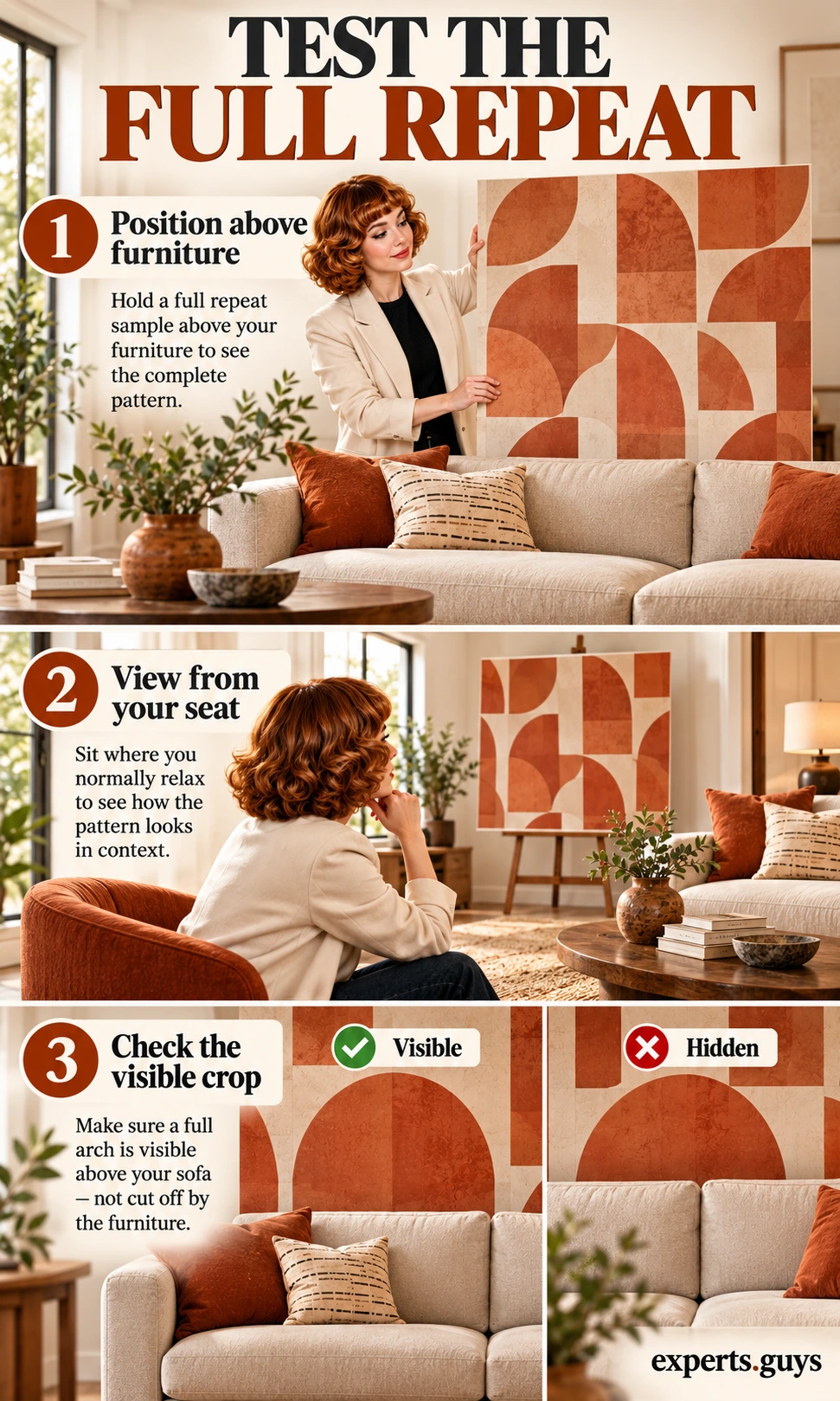
Use a full-size sample, a supplier-provided full-repeat print, or a rigid sample board with the intended shape at actual size. This test is for scale and visibility; a small color chip cannot substitute for it. If the surface is delicate, freshly painted or unsuitable for adhesive, have a helper hold the board or support it on a stable easel instead of taping it to the wall.
- Position the sample where the repeat will sit above the furniture, keeping the furniture in its intended place.
- View it from the seat you normally use, then from the entry to the room. Look for the whole recognizable motif, not just a pleasing color.
- Try the larger or smaller candidate in the same position. Keep the palette similar so scale is the main change.
- Choose the version whose shape remains readable without overwhelming the furniture. If neither works, reduce contrast or change the repeat rather than accepting a poor fit.
For example, suppose the exposed strip above a headboard is 30 inches high. A 36-inch-tall emblem cannot appear there in full, even though it fits the total wall height. You might deliberately accept the crop, choose a smaller emblem, or use a design whose incomplete shapes still read naturally. The checkpoint is whether the visible crop looks intentional from the bed’s entry view.
Separate pattern size from contrast
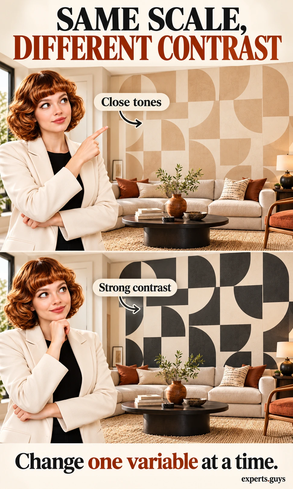
High contrast makes boundaries more conspicuous. When a small repeat feels busy, enlarging it may help, but reducing the difference between the background and motif can change the effect without changing its size. Compare two samples at the same scale and in the same position before deciding which variable is causing the problem.
Place the close-tone sample and the stronger-contrast sample in turn beside the actual upholstery and flooring. View each from the same seat. If both are hard to read, the scale or crop is probably the more useful variable to change; if only the stronger version feels distracting, keep the geometry and soften the contrast. A portable board makes this comparison possible without fixing anything to the wall.
Finish the color decision after this comparison. The separate guide to accent wall paint color addresses palette selection; this page keeps the focus on how color differences affect pattern legibility. Metallic and glossy finishes also need a lighting check because their apparent contrast can vary with viewpoint.
How do you align a pattern without awkward edge cuts?
Choose a visual anchor, dry-fit the repeat across the width, and compare at least two starting positions. Do this before ordering a fixed mural crop or committing to installation. Starting at the left corner is convenient, but it does not automatically give the best composition at the right corner or behind the furniture.
Choose the centerline people will actually notice
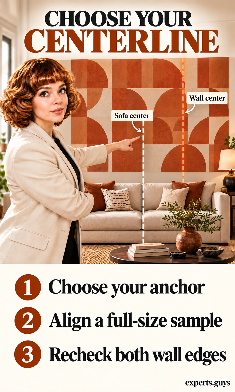
Use the wall midpoint when the wall itself is the symmetrical feature. Use the furniture midpoint when a bed or sofa clearly owns the composition and will stay in that position. If those points differ, decide deliberately which relationship matters more; splitting the difference can leave both looking slightly wrong.
Measure the furniture width with a tape measure and identify its halfway point. Position a vertical laser line through that point, following the device instructions and keeping the beam away from eyes; a helper holding a straight edge or a free-standing reference can serve for a small sample. Compare a motif centered on the line with a gap centered on the line. Neither is universally correct, but one will often relate more cleanly to the furniture.
In an illustrative 144-inch wall with a sofa centered at 66 inches from the left boundary, the furniture anchor and the wall midpoint differ by 6 inches. A wall-centered design is mathematically balanced across the plaster; a sofa-centered design is balanced across the seating group. Keep that distinction visible while you judge the ends. No drilling, fastening or electrical work is needed for this check.
Dry-fit the edges before committing
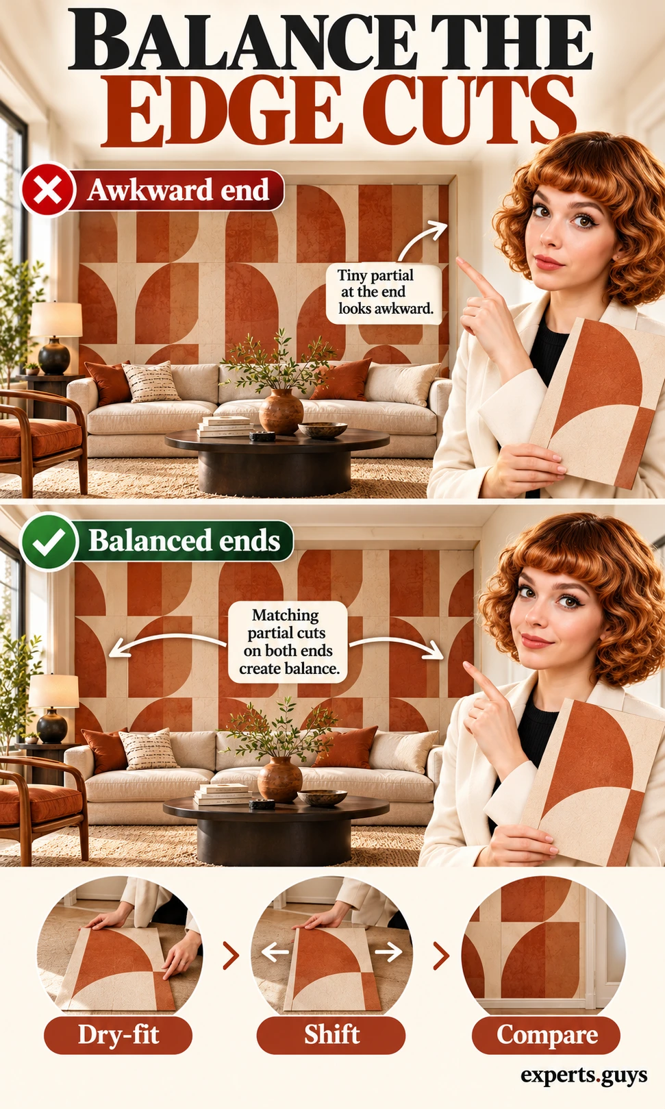
For a simple repeat, measure the horizontal repeat in the direction you are arranging it. Do not substitute a wallpaper label’s vertical repeat or the roll width. Lay movable full-size motif cards along a clear floor area, or ask a helper to hold sample panels against the wall, and compare a whole motif at the start with a shifted start that balances the cropped ends.
An illustrative 144-inch span with a 20-inch horizontal repeat contains seven complete repeats plus 4 inches. If you insist on starting with a whole repeat, that remainder appears at one end. A more balanced composition might use six whole repeats with 12-inch cropped portions at each end: 12 + 120 + 12 = 144. Those are portions of the motif, not wallpaper seam locations or cutting instructions.
Moving the start changes which part of each motif appears at the boundary. Equal-width fragments can still look unequal when one contains a dark flower and the other contains empty background. After calculating the widths, check the actual artwork. If a centered motif produces poor ends, compare a centered gap, another repeat size or a less rigid pattern.
Before you commit
Repeat Fit
Compare horizontal repeats and equal edge fragments on one uninterrupted wall span.

Enter the width of your selected span and the horizontal motif repeat. This is a composition check, not a wallpaper roll estimate or installation drawing.
Equal edge widths do not guarantee matching artwork. Check your full-size sample, furniture anchor and openings. Wallpaper seam positions, vertical matching, waste and roll quantities are excluded.
The Repeat Fit calculator compares whole-repeat and equal-edge arrangements for a rectangular, uninterrupted span. It does not estimate wallpaper rolls, account for doors, or choose where a supplier’s seams fall. Use its result as a layout comparison, then confirm the real motif with your sample before you buy.
Check what doors and furniture will hide
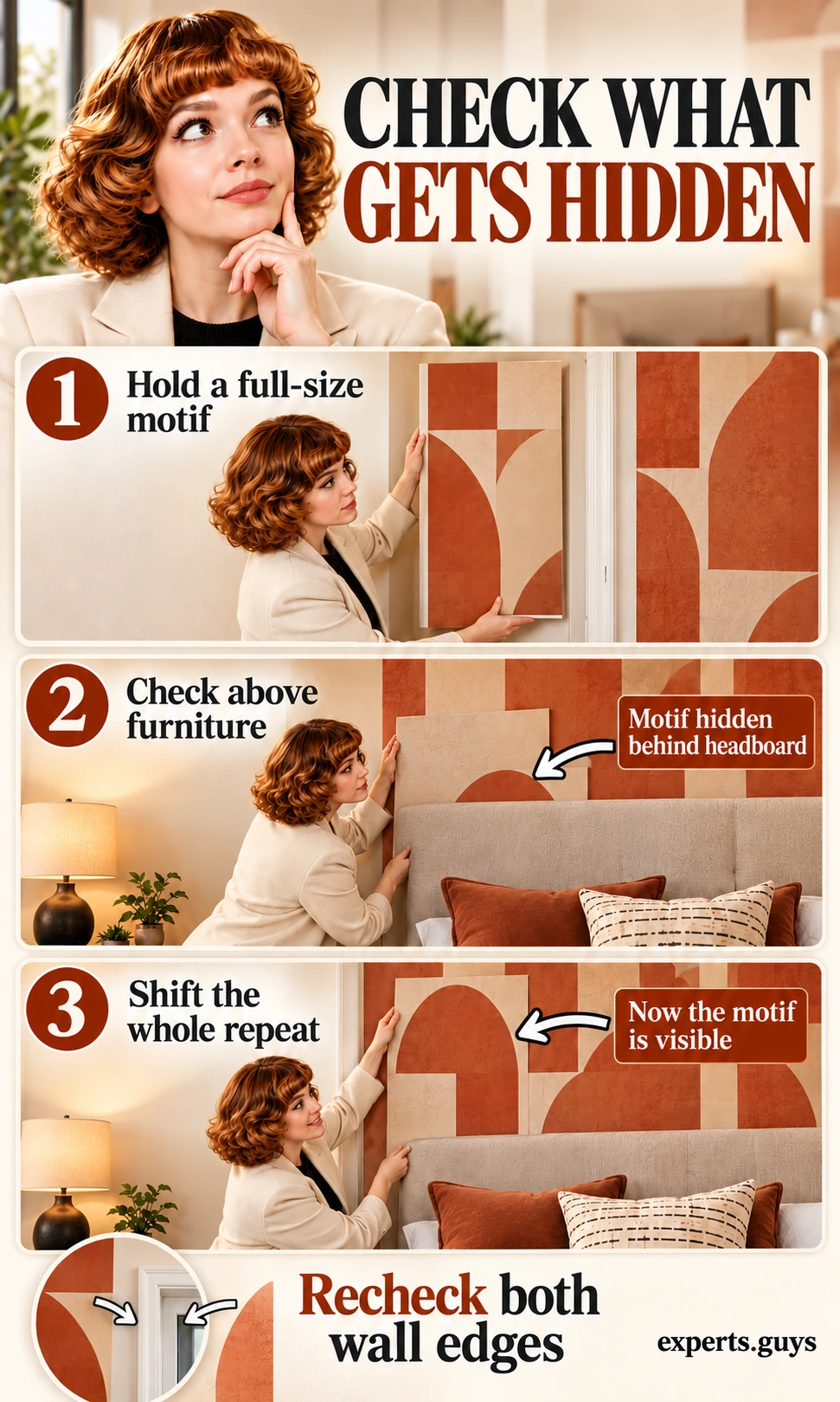
Move the full-size sample through the actual interruption zones: beside a doorway, above the sofa and next to the cabinet edge. Keep its relationship to your chosen centerline consistent. This reveals whether a motif ends in a readable fragment or whether the room repeatedly cuts off its most recognizable part.
If the focal shape disappears, try a modest shift of the whole repeat and recheck both boundaries; do not move individual motifs independently in a fixed wallpaper repeat. If the shift fixes the doorway but ruins the sofa composition, change the scale or pattern. For a mural, approve a supplier’s complete wall mockup with openings and furniture positions represented before placing the order.
Repeated wallpaper has separate matching constraints. A straight match lines adjacent strips up at the same vertical position; a drop match offsets them by the amount specified for that design. The manufacturer’s repeat, match, strip width and trimming allowance govern material use. York’s installation guidance distinguishes product-specific preparation and matching, so an area-only calculation is not a reliable purchasing method for every patterned paper.
If you choose raised timber rather than a flat pattern, move on to the dedicated wood accent wall installation guide for that different project scope. The visual layout should be settled first, but this repeat exercise is not a fastening plan or a check for concealed services.
What should you check before ordering or installing?
Approve the real sample under the light you use, confirm the wallcovering’s surface requirements, and inspect the composition from two everyday viewpoints. These checks solve different problems: the layout can be right while the finish glares, or the color can be right while the adhesive is unsuitable for the wall.
Check light and surface before buying
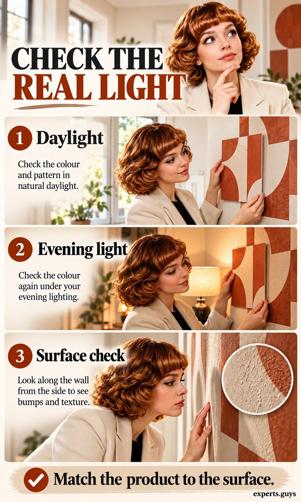
Place the same sample board in its intended position during daylight and again with your usual evening lights on. View it from the seat and slightly to the side. Look for reflections that erase the motif, harsh shadows from a raised surface, or a background color that becomes much more prominent. Keep the board’s position unchanged so you are comparing lighting rather than a new placement.
Use ordinary side light to look along the existing surface before committing to a thin wallcovering. Raised repairs, flaky paint and texture can remain visible or affect adhesion. Stop at observation if the wall is damp, crumbling or has an unexplained stain; covering it is not a repair. Do not sand, scrape or drill unknown older coatings as part of this layout exercise.
A removable label is not a promise of damage-free removal on every substrate. Verify the exact product’s permitted surfaces, preparation, curing time and sample-test instructions. For example, York’s peel-and-stick installation guidance calls for a smooth suitable surface and at least four weeks of curing on newly painted surfaces; other products can differ. A successful color test does not establish adhesive compatibility.
| What you notice | What it suggests | Useful next decision |
|---|---|---|
| Motif vanishes behind the sofa | The visible crop is too small for the important detail. | Change scale or whole-pattern position before purchase. |
| One skinny fragment dominates a corner | The start position leaves an awkward remainder. | Compare balanced edge crops and a centered gap. |
| Every line seems to compete with the rug | Similar strong rhythms share the same view. | Compare a quieter contrast or a different pattern family. |
| Evening light creates a bright reflective patch | The finish changes with viewing angle and illumination. | Compare a less reflective sample under the same lighting. |
| Surface is textured, loose or damp | Appearance and adhesion checks are not yet satisfied. | Resolve the substrate issue and follow the selected product specification. |
Approve the layout from two viewpoints
Use removable, surface-appropriate tape only after a discreet compatibility test, or use held sample boards if tape is unsuitable. Show the main motif boundaries at full size around the focal furniture. You do not need to outline every repeat; show enough of the center and both ends to judge the composition without turning the room into a drawing exercise.
- From the doorway, check that the chosen anchor reads as intentional and the main motif is visible.
- From the normal seat, check that the pattern remains comfortable to look at and does not disappear behind furniture.
- Inspect both ends: identify the actual shapes being cropped, not just the numerical widths.
- Keep the arrangement only when the two viewpoints agree well enough for how you use the room. Otherwise change one variable and compare again.
If moving around the room is difficult, ask a helper to hold the boards while you stay in the seat that matters most. For an inaccessible high wall, use a supplier’s dimensioned elevation for the overall crop and a safely reachable sample for finish. Do not climb on furniture to make the preview complete.
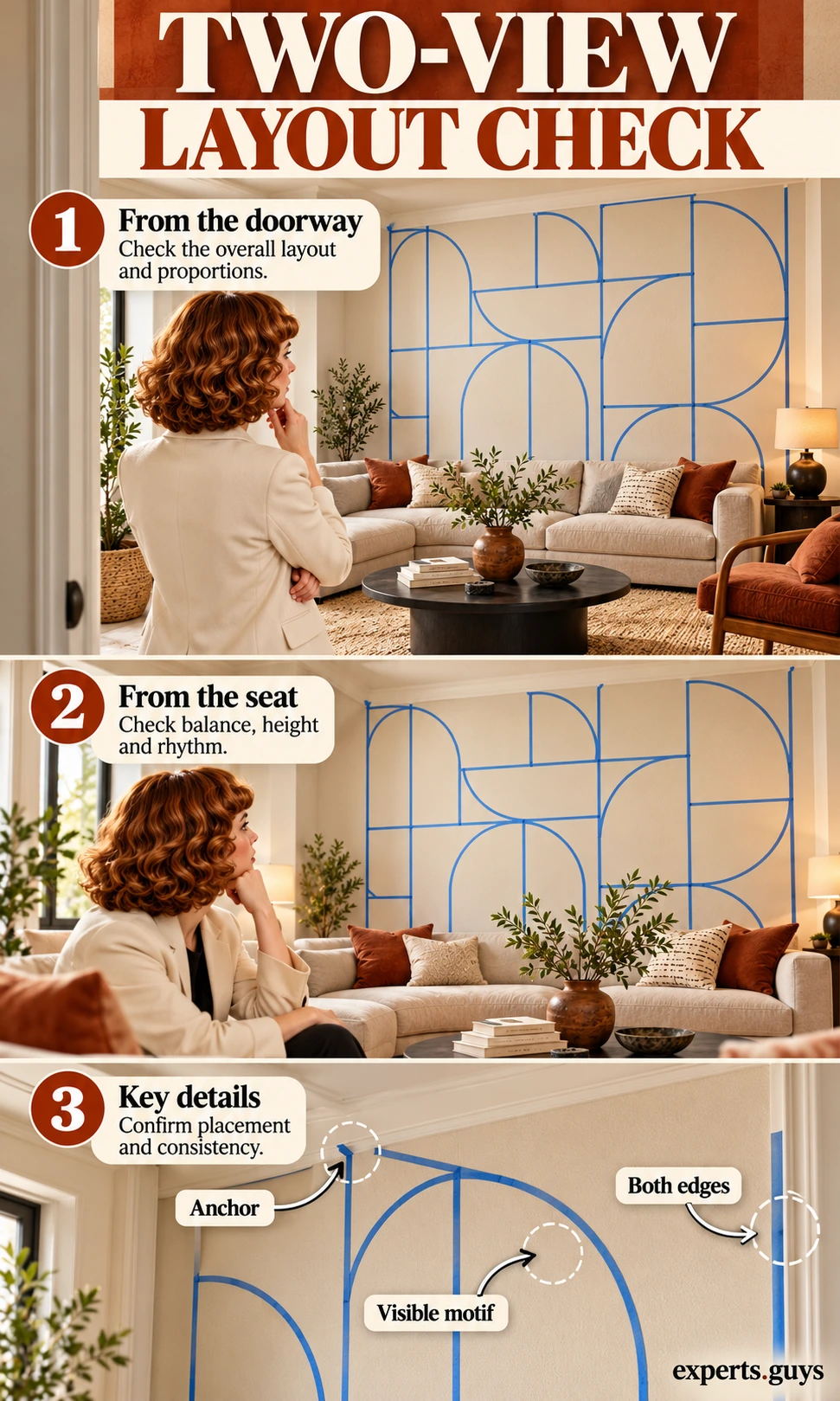
A useful approval is specific: the anchor is chosen, the recognizable motif survives above the furniture, the end fragments are acceptable, and the finish works under the intended light. Keep ordering quantities and installation requirements as separate checks. This prevents a visually successful mockup from being mistaken for a complete materials specification.
Accent wall pattern questions
Can I use a large pattern in a small room?
Yes, when enough of the motif remains visible and its contrast suits the other surfaces. Room size alone is not a reliable cutoff. A large, quiet motif can be easier to read than a dense small repeat; judge a full-size sample from the position where you normally see the wall.
Does the wallpaper repeat tell me the stripe width?
Not necessarily. The labeled repeat often describes the vertical distance before the printed arrangement repeats, while your stripe or motif spacing across the wall is a horizontal measurement. Check the specification and actual artwork before entering a repeat into the calculator.
Should the pattern continue around the corner?
Only when the composition and chosen installation system support it. A focal wall can end cleanly at an inside corner. Continuing a rigid motif onto another plane adds matching and out-of-plumb complications, so settle that scope before ordering rather than improvising at the last strip.
Is a painted pattern easier to change than wallpaper?
It depends on the paint layers, surface texture, wallpaper system and substrate. A painted design may need preparation and recoating; wallpaper may require removal and surface repair. Choose based on the actual product and wall condition, not a universal easy-removal claim.
Can the calculator tell me how much wallpaper to buy?
No. It compares horizontal visual repeats only. Roll requirements also depend on roll dimensions, wall height, vertical repeat, match type, trim allowances, openings and usable offcuts. Use the chosen product’s calculation method before ordering.
Your layout approval checklist
- Choose the pattern family for the kind of visual order the room needs.
- Test a full-size repeat above the real furniture.
- Select a wall or furniture anchor deliberately.
- Compare the actual shapes at both edges and around obstructions.
- Approve the sample under everyday lighting, then check the exact material and installation requirements.
Compare Local Home Specialists Near You
Tell us what kind of help you need, then compare nearby businesses by location, Google rating, review volume and contact options.
HomeFix Local Match
Turn a home problem into a practical local hiring decision. Check the clues, see the specialist types that fit, open focused surrounding-location searches, then compare the strongest three before you call.
 YOUR PROBLEM
YOUR AREA
COMPARE 3
✓ Ready to compare
What is happening?
Choose the closest problem type, then check every clue that applies. Your selections change the specialist order.
Where should the search focus?
Use Google’s “near me” context or enter the area you actually want a specialist to serve.
Simple local search: open nearby Google results, choose the businesses that look suitable, then compare your best three here before you call.
Problem snapshot
Who should you call first?
These are the specialist types most likely to fit the clues you selected.
Search around your location
Compare your top three
Use the same factors for each option so a high star rating does not hide a weak scope, poor diagnosis, missing credentials or unclear aftercare.
Comparison result
Your result combines the Google signals you entered with the practical hiring checks you completed.
Questions to ask every finalist
Use the same questions with each shortlisted business so the comparison stays consistent.